You’ve done the work of driving traffic to your website. But what now? How can you encourage those visitors to engage with your site and make a purchase? Storyly wanted to create fine-tuned journeys for their website visitors, and they turned to OptinMonster to make it happen. With a few targeted campaigns, they boosted their conversions and grew their email marketing list.
Meet Storyly
Storyly is a content experience platform for mobile eCommerce apps and websites. It lets businesses create full-screen content experiences that are interactive, personalized, and shoppable.
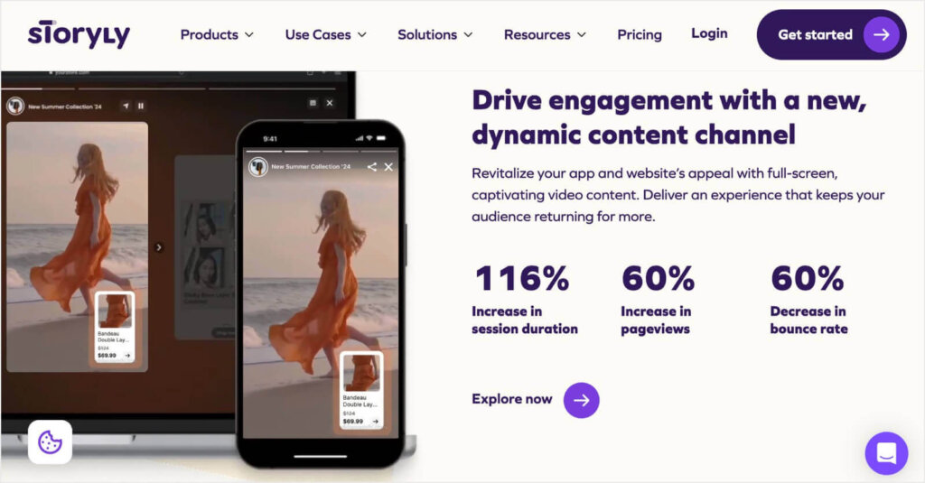
Storyly was founded in 2020 and already has more than 200 million monthly active users and over 1 billion impressions. And now, the company is growing even more by using OptinMonster.
Storyly’s website was getting a lot of high-value traffic from 2 sources:
- Blog posts on topics closely related to their product
- Cold outreach from their sales representatives
The company wanted to improve the website journey for these visitors. Specifically, they wanted to optimize that journey to drive more conversions on their contact and optin forms.
Let’s see how OptinMonster helped them raise those conversion rates.
How Storyly Uses OptinMonster to Skyrocket Conversions
Berkem Peker, Storyly’s Growth Strategist, says the company used “everything in OptinMonster’s arsenal” to move website visitors through their sales funnel.
Storyly has a quick demo video that explains their product’s features and benefits in just a few minutes. The demo functions as a lead magnet because users have to enter an email address to access the video.
Storyly used OptinMonster to create this content-locking popup, which requires users to subscribe before watching the video:
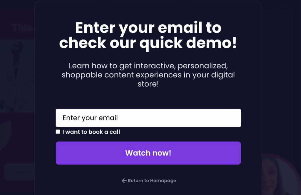
Storyly removed the option to simply close the popup. This gated the content because visitors have to either enter their email or click Return to Home Page.
This OptinMonster campaign has a phenomenal conversion rate of 14.57%.
Each converted visitor is moved through Storyly’s sales funnel in 2 ways:
- They become a new lead on Storyly’s email list. Storyly can now market to them directly with feature announcements, webinar invitations, and more. Since using OptinMonster, Storyly has grown their email list by 45%.
- These visitors made the effort to enter an email address, so they’re likely to actually watch Storyly’s quick demo video. In doing so, they get a concise explanation of the software’s features and benefits.
OptinMonster gives you precise control over the Display Rules for your campaign. Storyly uses a combination of basic and advanced settings to determine who will see their content-gating popup and when:
- Page-Level Targeting: This popup displays only on their quick demo page.
- Timed Display Control: The campaign displays immediately, so visitors have to enter their email before seeing the video.
- Query Targeting: Storyly has a different popup for visitors navigating from their homepage, so they used query targeting to exclude those visitors from seeing this campaign.
Next, Storyly wanted to reduce abandonment from their Contact Sales page. Because of the custom nature of their product, all leads are funneled through this page when they’re interested in purchasing.
Of course, not everyone who ends up on their Contact Sales page is ready to talk to a sales representative. Storyly decided to use OptinMonster’s Exit-Intent® Technology to prevent those visitors from leaving their site.
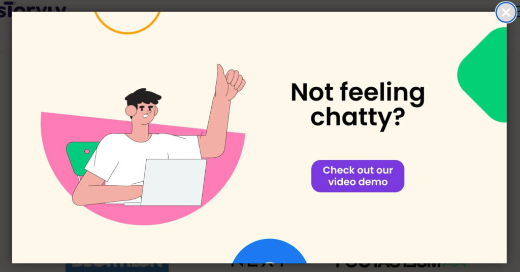
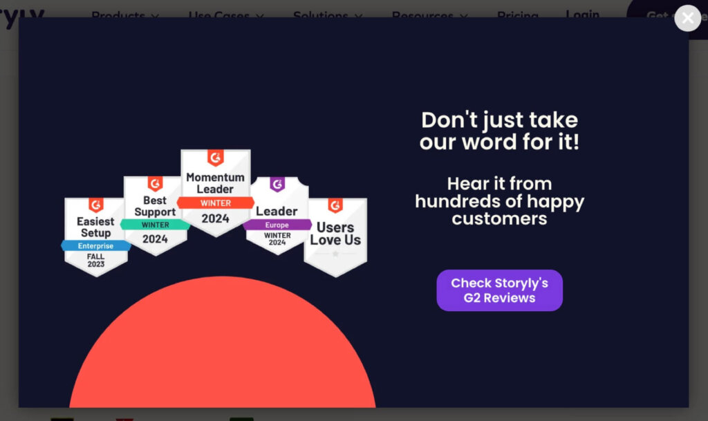
Storyly took advantage of OptinMonster’s Split Testing feature to compare the performance of 2 different campaigns:
Version 1: The call-to-action (CTA) button directs abandoning visitors to the quick demo video we just discussed. There, the content-locking popup asks for their email address to access the video.
Version 2: This version highlights Storyly’s G2 awards and directs visitors to the software’s customer reviews.
Storyly used 3 of our most popular targeting and triggering features for their test:
- Page-Level Targeting: They targeted the test popups to display only on their Contact Sales page.
- Device-Based Targeting: Only desktop users would see one of the popups.
- Exit-Intent® Trigger: The popups were triggered when a visitor tried to close the site.
Version 2 converted at a very respectful 2.4%, but it was beaten by Version 1, which converted at an excellent 6.14%.
Those exiting visitors would likely have been lost forever. But with a split-tested OptinMonster popup, Storyly keeps more visitors engaged on their site. Plus, the winning popup directs users to the quick demo lead magnet, helping the company grow its email marketing list.
These examples are a glimpse at how Storyly uses OptinMonster to engage, direct, and convert their website visitors. Here are 2 more campaign strategies they use across their site:
- Visitors on certain blog posts see a Slide-in Box asking them to subscribe to their email newsletter. The slide-in box provides an unobtrusive way to ask organic visitors to join their list.
- Storyly added an exit popup to the product page for their App Stories product. The campaign asks users to visit either the Contact Sales page or a related tutorial. This was part of their larger strategy to drive high-intent visitors through their funnel. Their efforts had a phenomenal result: The conversion rate on their Contact Sales form grew by 80%.
As you can see, OptinMonster gives Storyly fine control over the journey of their website visitors. In fact, this strategy led to a 66% increase in traffic to their high-intent pages. With just a handful of campaigns, Storyly moves users through the sales funnel by directing them to helpful content and encouraging email signups.
Results
Using content-gating, split testing, and Exit-Intent®, Storyly saw these impressive results:
- 14.57% conversion rate on their content-locking optin popup
- 80% higher conversion rate on their Contact Sales form
- 45% growth of their email list
- 66% increase in traffic to high-intent pages
Summary
Storyly is an excellent example of what smart marketers can accomplish with OptinMonster. They didn’t just throw up a few popups. Instead, they closely analyzed their sales funnel. Then, they created onsite campaigns to carefully nurture new leads toward an eventual purchasee.
With OptinMonster’s easy drag-and-drop builder and 700+ templates, you can create a campaign in minutes. You can also precisely target your campaign in just a few clicks.
Storyly is far from alone in their success. Check out how Shockbyte More Than Doubled Their Sales Conversion Rate With Exit-Intent!
Try OptinMonster today, and join the 1,000,000+ users who know it’s the best lead-generation software on the market.
“OptinMonster is super easy to use and set up. Since we started using it to create journeys within our site, our form conversion rates have increased by almost 80%. Thanks to Exit-Intent®, we love [OptinMonster’s] effectiveness at turning cold organic visitors into higher-intent users. Split testing functionality and SEO friendliness are the icing on the cake!”
Berkem Peker, Growth Strategist, Storyly


