Do you know how many mobile devices there will be in circulation worldwide by 2020?
14 billion.
If you’re not using mobile-specific campaigns to target on-the-go shoppers and visitors to your site, you’re missing out on enormous sales potential.
So, what’s a savvy site owner to do?
As always, OptinMonster is here for you. This time, we’ve got you covered with new mobile popup templates that make getting the attention of your mobile customers and visitors even easier.
Introducing Mobile Floating Bar Templates
Floating bars (also called “hello bars” and “notification bars”) are a great way to keep your offer in the minds of visitors as they scroll and browse through your site. And now, with our floating bars built specifically for mobile popups, you can use these versatile and high-performing campaigns to target your mobile visitors—without taking up too much valuable real estate!
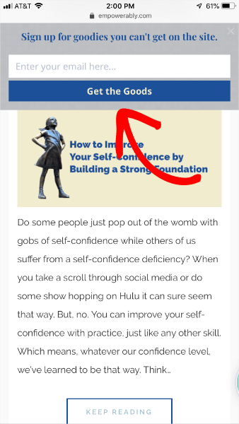
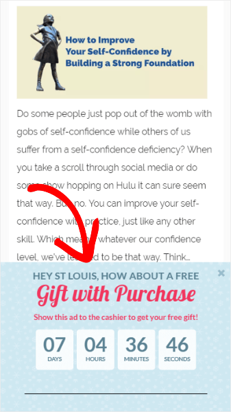
Here’s a screenshot of what it looks like in the wild (on an iPhone 8+):
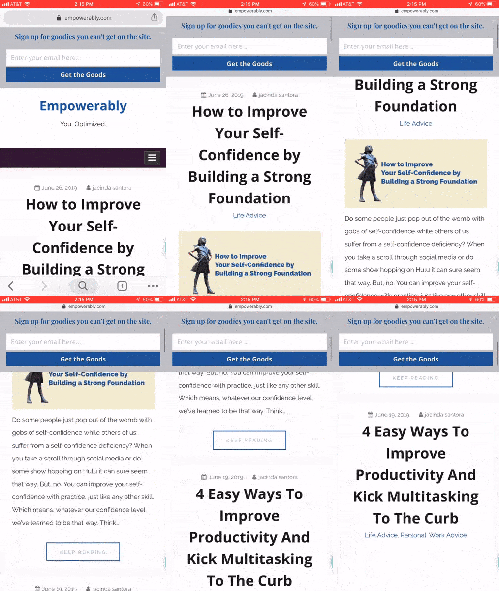
And, just like the floating bars for desktop users, these mobile floating bars follow you as you scroll:
Ways to Use Mobile Floating Bars
Floating bars are great for making announcements, getting new subscribers, running limited-time offers, and just about anything else. Definitely take a look at our article on creative hello bar examples for ways to use floating bars to target both mobile and desktop users.
Where mobile floating bars will really shine and make magic happen for you is click-to-call and location-based targeting.
Click-to-Call
If you’re a business that survives through telephone communication, mobile floating bars are the perfect way to keep your phone number not only available to site visitors but clickable to site visitors.
Adding click-to-call is so very easy with OptinMonster, too.
When you’re building your mobile floating bar campaign, just include a button and change the button text to your call to action. We use “Call Now!” in the example below, but you actually have quite a bit of room to be a bit more creative than that.
Next, change the button action to click to call and enter the phone number you want to dial when the button is clicked.
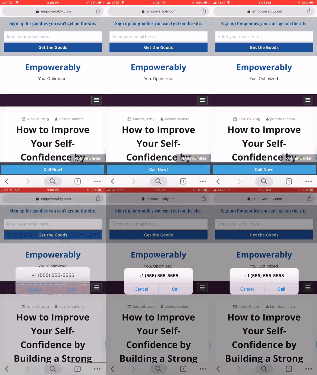
This is what happens when it’s live on a site:
Build the Campaign of Your DreamsDid you know that every single one of OptinMonster’s already gorgeous templates is fully customizable? You can pick your favorite professionally designed template and customize to your heart’s content. Or, if you already have a design in mind, choose the Canvas template to turn it into a reality. Get started today with OptinMonster and enjoy flexible, fully customizable popup and optin form templates!
Location-Based Targeting
People pretty much always have their mobile phones with them. With OptinMonster’s geolocation feature you can target users based on their location, creating personalized campaign messaging.
You may already know that about 80% of shoppers will turn to online search even if they plan on visiting a physical store location. But, did you know that shoppers are also using search while they shop to help them narrow down their choices?
Combining OptinMonster’s geolocation with our mobile-specific popups is a perfect opportunity for your brand and products to stand out above the rest with a well-placed discount that shoppers will see when they visit your site to decide if they want to purchase from you.
The mobile popup above includes a Smart Tag to show the city name so you can tell that it’s location-based. To create your own location-based campaign, check out our tutorial.
OptinMonster to Continue Project Delight Improvements
We began Project Delight in January 2019 to capture all of the user experience and user interface improvements that we have planned for OptinMonster. We wanted to show our users that OptinMonster is the powerful tool they need to get the conversions they want but it can also be a great experience—delightful, even—to use.
OptinMonster just works. And it works ridiculously well.
Over the past several months, Project Delight has brought you improvements like:
- Site, integration, and analytics defaults so you don’t need to set them for each campaign
- A better builder experience with smoother drag-and-drop, auto-open input fields, draggable column widths, and more
- Campaign solutions and goals to make finding the right campaign super easy
- Mobile-specific campaigns
- Native analytics
- …and more!
The feedback from Project Delight has been overwhelming and wonderful.
So, we’re keeping it going.
What’s In Store for Project Delight?
We can’t give away all of our secrets or you won’t be as delighted when they roll out. But, you should definitely be on the lookout for big improvements to the Publish screen in the OptinMonster campaign builder.
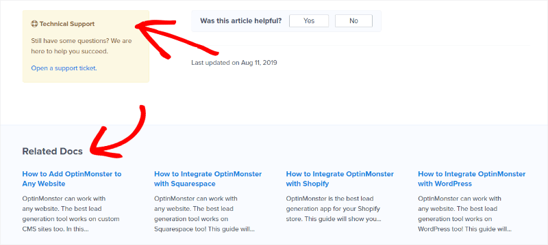
We’re also going to be improving the Help screen and we’ve already created a new template for our Documentation to make them more helpful. Specifically, we’ve added easy access to create a support ticket, as well as a section showing other Documentation related to the one you just read:
Of course, that’s not even scratching the surface of what we have in store. If you’re not yet an OptinMonster customer, you’re really missing out. Get started today and help us improve your experience while we help you win more sales and more subscribers than ever before.

