Do you want to increase initial customer acquisition? Once a prospect becomes a customer for the first time, it is much easier to sell additional products and services.
In this case study, we’ll show you how DigitalMarketer not only increased initial customer acquisition but actually converted 15% of abandoning visitors into customers with Onsite Retargeting.
Meet DigitalMarketer
DigitalMarketer is a community where marketers, growth hackers, entrepreneurs, and small business owners come to get ideas on driving more traffic, increasing conversion rates, and boosting social media engagement.
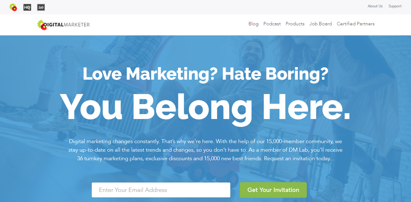
Justin Rondeau is the Director of Optimization at DigitalMarketer and runs all of their optimization efforts and split tests. Before using OptinMonster, Justin used OptiMonk.
While OptiMonk helped to convince him of the effectiveness of using popups to increase subscribers, he also had a few problems with it.
One problem was that every time he wanted to change a design or launch a new one, he had to email the template to OptiMonk support. This tedious process was wasting valuable time, and slowing down their conversion growth.
Justin wanted more control over his campaigns, and he found it with OptinMonster’s easy point and click editing.
OptinMonster allows you to edit every element of your optin without needing a developer or support. Launching an optin is as simple as setting it to live.
So, Justin made the switch from OptiMonk to OptinMonster.
Here’s what happened next…
How DigitalMarketer Converted 15% of Abandoning Visitors into Customers
There are many reasons why someone visiting your site would leave without making a purchase or converting.
Some don’t purchase because they think they don’t need your product. Others don’t purchase because the product is actually more than they think they need.
Are you offering a downsell to those prospects?
For example, if you sell dog food and offer $20 off 100 lbs of food, prospects with large dogs (or a lot of dogs) will convert easily. However, a prospect with a small dog might feel that 100 lbs of dog food is way more than they need. Offering a deadline on that $20 coupon will not help to convert that prospect because the offer is not a good fit (even if the product itself is).
Instead, offer a downsell with an exit-intent optin.
A downsell is offered to narrow or reduce the customer’s expectation with a product that still serves their needs.
Just when the prospect is about to leave your site is the perfect moment to offer a downsell, and you can do that with OptinMonster’s exit-intent technology.
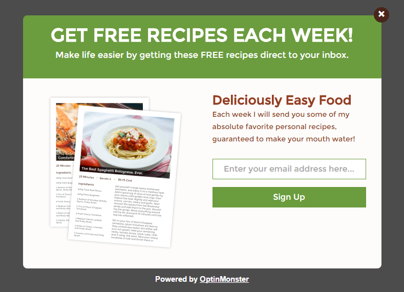
That’s exactly what Justin did. He used OptinMonster to create a lightbox optin using our “Gourmet” theme. This is what the basic Gourmet template looks like before any customization.
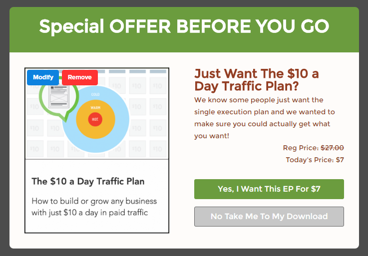
Customizing this template took just a few clicks. First, he changed the copy to reflect his downsell offer (a $10/Day Traffic Plan). Then, he changed the image to an image of the downsell offer. Finally, he activated Yes/No buttons, and customized them so that visitors could either buy the downsell now or say “no”.
Here’s what that popup looked like after Justin had finished customizing it:
This lightbox converted at 15%.
That’s incredible! This means that 15% of readers who were about to abandon the site entirely, and quite possibly never come back again, actually purchased when offered the less costly option.
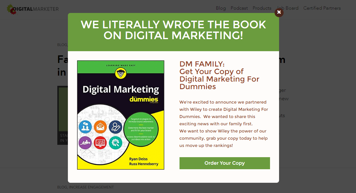
Justin used a similar approach during the launch of their book, Digital Marketing for Dummies…
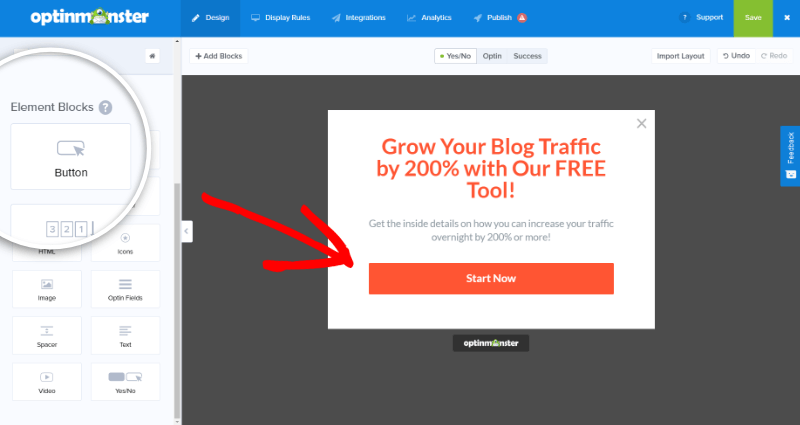
Instead of the default email subscription form, Justin wanted to display a link to Amazon.com where readers could purchase the book. So, he again activated Yes/No buttons, but this time he turned off the No button.
The builder has since been updated, so you can easily add a single button to any view:
After changing the copy and swapping out the image, Justin set this lightbox to appear after the reader scrolled down 25% of the page. Here’s what that optin looked like:
Of those who viewed this optin, 7.9% clicked through to the order page.
Boosting Conversions with Urgency – DigitalMarketer
These results were awesome, but there’s more. Justin also wanted to increase ticket sales for their Traffic and Conversion Summit, and he did that quite successfully. Here’s how…
First, he used OptinMonster’s highly noticeable floating bar campaign, again enabling the Yes/No buttons feature. This floating bar offered 50% off Traffic & Conversion Summit Tickets.
Then, he took advantage of readers’ fear of missing out (FOMO) by including the deadline: “Until Friday 12/23!”.
The optin converted at 8.45%.
Justin then used a similar strategy to launch TruConversion, a feedback and analytics tool designed to increase conversions. But this time, he created urgency by limiting the number of available beta invitations.
This optin converted at 6.62%.
In the future, Justin might also want to use our new countdown timer for floating bars to create a sense of urgency. Here’s what the countdown timer looks like on our own website:
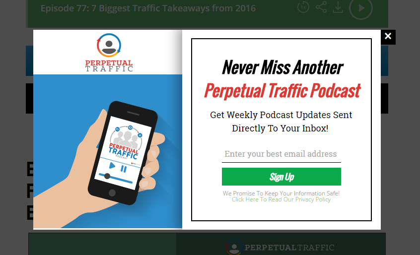
For their Perpetual Traffic Podcast, Justin again drew on the reader’s fear of missing out. This optin promises the reader will “never miss another episode” if they subscribe.
This optin converted at 6.64%.
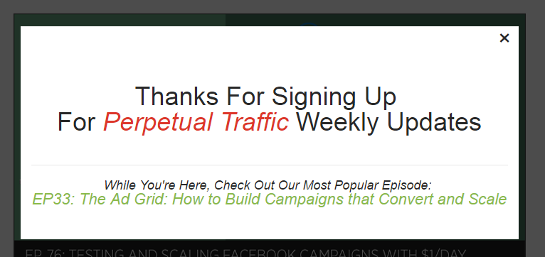
There is even a small bonus in the success message: a link to their most popular podcast!
As you can see, creating a sense of urgency for your readers is one of the best ways to increase conversions. When making decisions that feel urgent, we automatically lean towards the “take action” route, because we’re afraid of missing out.
(Check out even more ways to create a sense of urgency here.)
Results
Digital Marketer increased conversions at every level of their sales funnel using OptinMonster:
- Using exit-intent optins, Digital Marketer converted 15% of abandoning visitors.
- Using lightbox optins, Digital Marketer added nearly 7% of readers to their podcast subscription list.
- Using floating bar optins, Digital Marketer converted 8.45% of readers into event attendees.
Summary
When you produce quality products, content, and events, your readers deserve every opportunity to receive that content. Don’t be afraid to try multiple types of optins on your site to share your most valuable content.
“OptinMonster has been extremely valuable when we need to create a targeted pop or banner quickly. The easy to use interface and templates gets us a site-ready design in only a few minutes. What’s best is we’ve only scratched the surface with all of the advanced targeting options, and we see OptinMonster being crucial to our marketing strategy in 2017.”


