

TL;DR:
1. Mobile Popup Design is live. You can now independently style your popups for desktop, tablet, and mobile inside a single campaign. No custom CSS or duplicate campaigns needed.
2. Show or hide blocks per device. A single toggle lets you show a block on desktop and hide it on mobile (or vice versa). No workarounds needed.
3. Available for all OptinMonster customers. Unlike Mobile Templates or Device Targeting, Mobile Popup Design is available to all OptinMonster customers.
4. Smarter defaults, even if you change nothing. We fixed the layout issues that caused broken form fields, off-screen close buttons, and oversized popups on mobile. New campaigns look better out of the box.
We’ve heard this one a lot.
You build a popup in OptinMonster, it looks great in the builder, you hit publish. Then you pull it up on your phone. The close button is off the screen. The two-column layout didn’t stack the way you expected. The form fields are so oversized and take up the whole screen.
You didn’t design it that way. We just didn’t give you enough control to do it exactly the way you wanted.
That changes today.
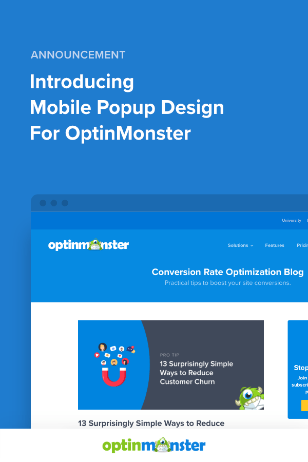
We’re launching Mobile Popup Design: full, independent control over how every OptinMonster popup looks on desktop, tablet, and mobile. It’s live in your account right now, and it works for all OptinMonster customers.
What is Mobile Popup Design?
Mobile Popup Design adds a dedicated layer of style controls to every popup view (desktop, tablet, and mobile) inside the same campaign you’re already building.
In the upper right-hand corner of the builder, you’ll find three device toggles: Desktop, Tablet, and Mobile. Switch between them at any point to see and edit exactly how each view looks before publishing and make changes as needed.

Here’s everything it lets you control:
Independent Styling per Device
Font sizes, padding, spacing, colors: you can adjust any of these independently for each device view. Your desktop layout and your mobile layout live in the same campaign, but can look completely different.
By default, styles cascade downwards from Desktop to Tablet + Mobile. All three devices are linked until you choose to customize one of the smaller devices (Tablet or Mobile).
When you change a style setting or hide a Block on a smaller device (like a tablet or mobile), you “break the link” for that specific Device. It becomes independent and will no longer inherit changes from the Desktop.
Here’s how that plays out in practice:
- Edit on Desktop only – Tablet and Mobile inherit the change
- Edit on Tablet – only Tablet updates; Desktop and Mobile stay as they were
- Edit on Mobile – only Mobile updates; Desktop and Tablet are unaffected
Worth knowing: once you unlink a device view’s style for a specific element, it can’t be automatically relinked. Use the Undo button if you need to reverse a change during your current editing session.
Show or Hide Blocks per Device
Want to show a video on desktop but skip it on mobile? Hide a decorative image on tablet? It’s one click. No duplicate campaign or CSS required.
There are two ways to manage block visibility:
Quick-hide: Hover over any block element in the builder, then click the eye icon in the element’s toolbar. That block is immediately hidden for whichever device view you’re currently in.

Manage Block Visibility: Look at the top of the left-hand sidebar for the Block Visibility section. This gives you a list of all blocks and lets you toggle each one on or off for the Device you’re viewing, including any you’ve already hidden.

Smarter Defaults out of the Box
Even if you never touch a Mobile Popup Design setting, your new popups will look better on mobile than before.
We fixed the opinionated defaults that caused the most common mobile layout problems: broken form fields, off-screen close buttons, and popups that scaled past the edges of small screens. Every new campaign starts from a better baseline.
5 Ways to Use Mobile Popup Design Right Now
1. Fix That Campaign You’ve Been Avoiding
You know the one. The campaign with the mobile layout you’ve been meaning to fix but kept putting off because it would mean rebuilding a whole separate mobile version.
Open it in the builder. Switch to the mobile view. Adjust the styling. Done. No new campaign needed.
2. Show Videos on Desktop, Skip Them on Mobile
Video blocks add weight to popups. On desktop, that’s fine. On mobile, it can slow down load time and crowd the layout.
Use Block Visibility to show your video block on desktop and hide it on mobile. Your mobile version gets leaner and faster without any extra work.
3. Simplify Multi-Column Layouts for Mobile
A three-column layout looks sharp on desktop. On a phone screen, not so much.
Previously, multi-column designs collapsed to a single column by default. Now, you can leave the desktop layout untouched and redesign the mobile view with one, two or three columns as you’d like.
4. Adjust Font Sizes and Spacing for Small Screens
What reads well at desktop size can feel cramped or overwhelming on mobile, even with our common-sense responsive defaults. You can now dial in font sizes, padding, and margins independently per device, just the way you want.
5. Build Your Best Mobile Layout From the Start
For any new campaign, start in desktop view, build your layout, then switch to mobile view and optimize from there. The real-time preview means you’re never guessing. What you see is what your visitors will see.
Available To All Subscribers
Mobile Popup Design is available to all OptinMonster customers.
Every user now has full per-device styling controls on every campaign, at no extra cost.
Mobile Popup Design vs. Device Targeting: What’s the Difference?
These are two separate things that work well together.
Mobile Popup Design controls how your popup looks on each device. Same campaign, different visual treatments per screen.
Device Targeting controls who sees your campaign based on their device. Use it when you want to show one campaign only to desktop visitors and a completely separate campaign to mobile or tablet visitors. Device Targeting is available on Plus, Pro, and Growth subscriptions.
Mobile Popup Design gives you a lot of control over how your popups look on different device types. If you want to go further with audience targeting by device, that’s where Device Targeting comes in.
How to Get Started
- Log in to your OptinMonster dashboard and open any campaign in the builder
- In the upper right-hand corner, use the device toggles to switch to Tablet or Mobile view
- Edit styles, toggle Block Visibility, or adjust layout for that device. Changes apply only to that view
- Use the eye icon on any block to quickly hide it for the current device, or use the Block Visibility panel in the left sidebar to manage all blocks at once
- Preview each device view, then save and publish
For a full walkthrough, visit the Device-Specific Design documentation.
Mobile Popup Design is live right now. Open your next campaign and build it the way it should look on every screen.
Related resources:
Until next time,

Angie and the OptinMonster Team
P.S. – Still not convinced OptinMonster is the best choice for you? Check out our 80+ OptinMonster case studies, complete with winning stats, detailed strategies, plus the exact templates and copy you can steal from learn from to win, and win more often!


