Are you an outdoor gear or active lifestyle brand already offering free shipping and a discount to subscribers, but not seeing the conversions you’d like from it? In this case study, we’ll discover how Sportique improved conversions 200% without creating even a single new offer.
Meet Active Lifestyle Brand Sportique
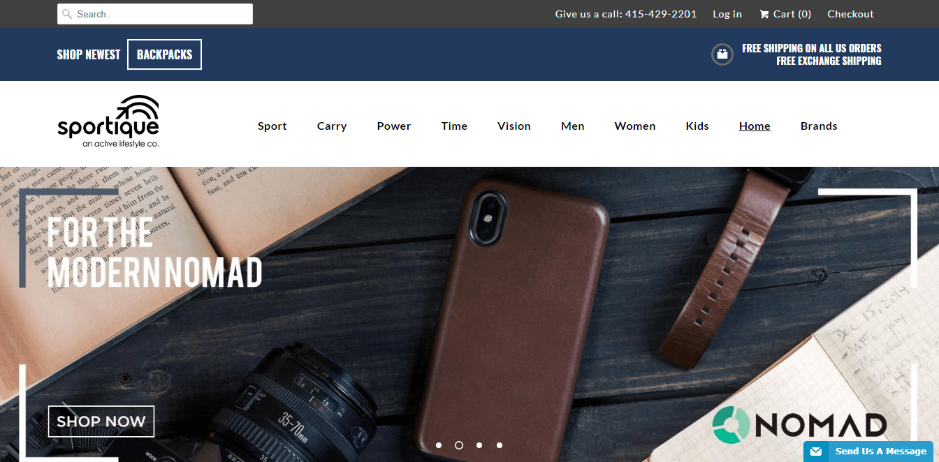
Sportique.com is a globally curated, lifestyle ecommerce company. They offer fashionable and functional products that propel adventures to the next level.
OptinMonster has been at the core of Sportique’s lifestyle brand marketing strategy from the earliest days. We’ve helped them drive their steady email list growth. Sportique sat down with us to share some of their best converting OptinMonster campaigns.
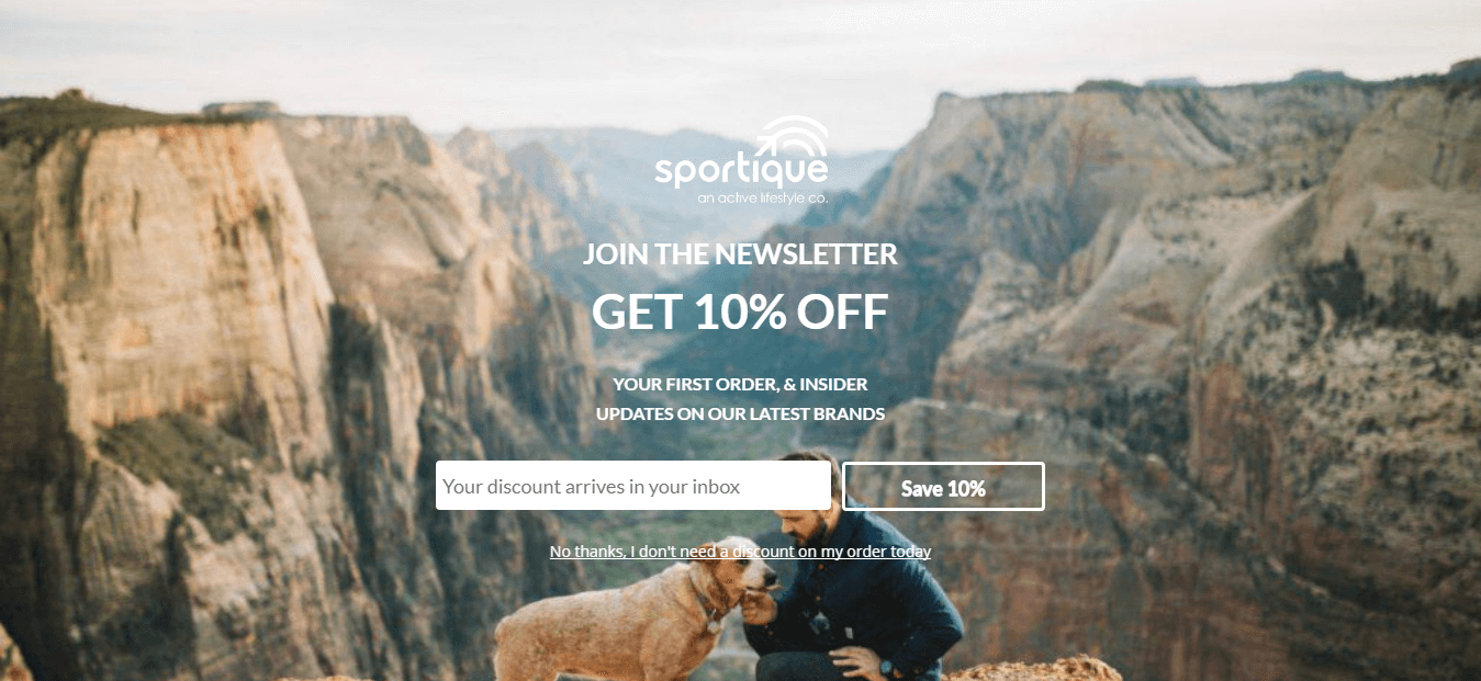
Sportique’s primary goal was to grow their email list. To encourage visitors to join, they offered 10% off the first order exclusively to subscribers. This is often where eCommerce stores begin when learning email marketing.
They first showed the offer using a full screen optin, set to display after the visitor had been on the site for at least four seconds.
It converts around 4.92% of visitors.
That’s a great conversion rate! You would think Sportique would want to show this optin to as many guests as possible, but they don’t. In fact, they exclude an entire segment of visitors from ever seeing it.
Lifestyle Brand Marketing Based on Location
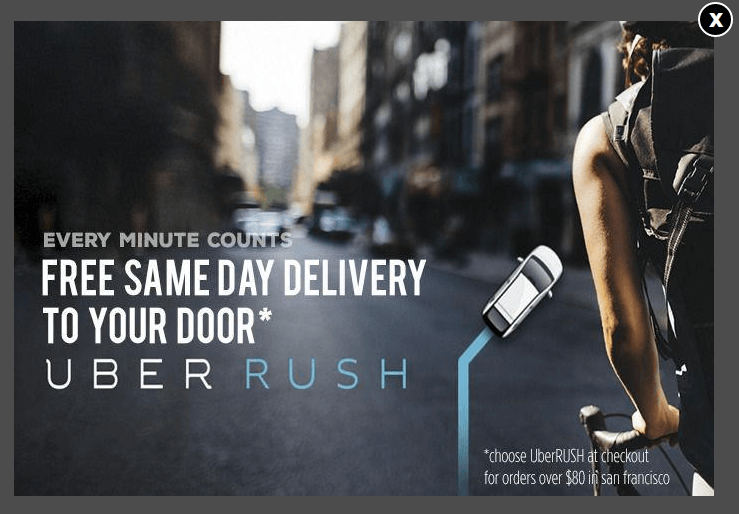
Sportique can deliver their products around the world. But in San Francisco, they offer local delivery through UberRush. Using our Geolocation targeting, the optin above is excluded from displaying for visitors from San Francisco.
Instead, they see this notice encouraging them to choose UberRush delivery at checkout:
Using 2-Step Campaigns to Boost Conversions
What Sportique did next would explode their conversions to 58% with just one click.
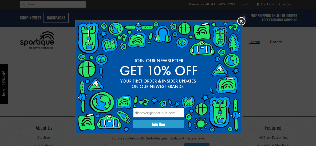
Sportique had been using a lightbox popup to present their 10% coupon throughout the site. It converted about 3% of all visitors to the website.
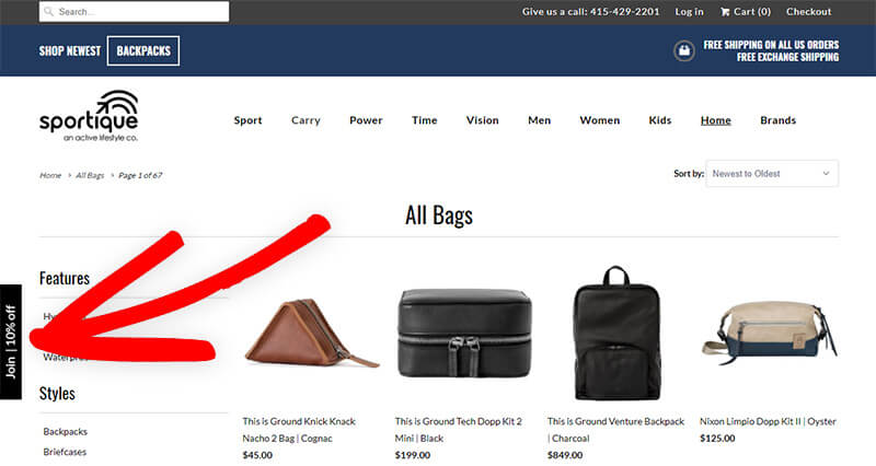
They decided to test the same lightbox, triggered by a MonsterLink. MonsterLinks launch a popup with the click of a button, text link or image. Readers who take the first step of clicking the MonsterLink are more likely to then complete the second step, the offer presented in the popup.
They used custom CSS to position the black MonsterLink vertically, on the left edge of the browser screen like a tab.
When visitors click the MonsterLink, the lightbox optin appears:
Using the MonsterLink, this lightbox now converts 58% of visitors who click it. On the cart page, it converts even more – a whopping 79% of shoppers.
Results
Sportique tested their lifestyle brand marketing strategy with several different ways of presenting the same offer and it paid off.
- Sportique converted 79% of readers using a creatively placed MonsterLink
- Sportique offered a 10% off coupon in a lightbox optin and 4.8% of claimed it
- Sportique tripled their email list growth, month over month
Summary
Sportique used multiple campaigns on their website to achieve great results. Two-step optins convert well because the reader already committed to completing the offer when they took the first action. Lightbox optins don’t rely on the user making a choice to view your offer. They interrupt the reader’s attention to present your offer. OptinMonster offers a variety of optin types to give you every opportunity to increase conversions.
OptinMonster has allowed us to rapidly innovative our on-site engagements, greatly improving our customer experiences. The robust testing capabilities have helped us increase conversion rates +200%, resulting in tripled month over month growth of our email list.
Ben LoBue, Sportique


