

Increasing conversions with OptinMonster is as easy as copying and pasting an embed code into your website’s header. But what if your IT department is reluctant or unable to allow access to the code?
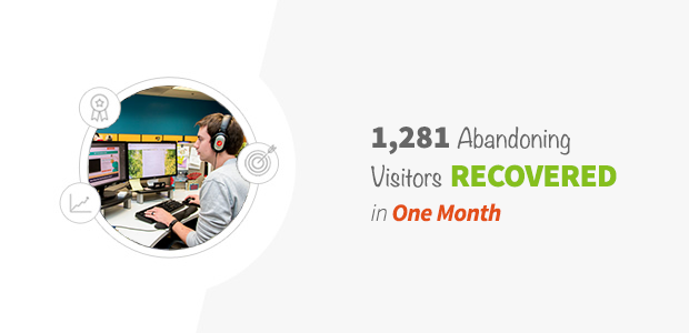
In this case study, we’ll share how one web design agency overcame these challenges with their client, and recovered 1,281 abandoning visitors in just the first month using OptinMonster exit-intent technology.
Meet WebMechanix and CareOneCredit
WebMechanix is web design agency that helps businesses generate leads and increase conversions, specializing in B2B SaaS products. Their client, CareOneCredit.com, is a debt consolidation company.
CareOneCredit.com was built using a proprietary, in-house software. Therefore, the development team doesn’t allow outside vendors to access the site’s code directly.
This presented a challenge for WebMechanix, who needed to add OptinMonster embed codes to the CareOneCredit website. WebMechanix knew our optins would provide an uplift in leads but without access to the site, they weren’t sure how to move forward.
Fortunately, OptinMonster integrates easily with Google Tag Manager, allowing WebMechanix to take the pressure completely off their client.
Since CareOneCredit was already using Google Tag Manager (GTM), WebMechanix was able to use OptinMonster’s Google Tag Manager integration to add tags which trigger the optins.

By simply adding the optin’s embed code as an HTML tag in GTM, WebMechanix was able to choose where, when and for whom an optin would trigger, all without needing to touch a line of the website’s code.
The result? A lot more control, with zero headaches.
However, there was another technical hurdle that WebMechanix had to overcome…
The CareOneCredit website was built using several different HTML templates, each with their own unique stylesheets. These stylesheets can interfere with an optin’s styles, displaying different styles and colors depending on the page and specific stylesheet loaded.
So how did they solve this problem?
Their development team used OptinMonster’s helpful custom CSS tool to preserve each optin’s styles.

This simple fix ensured a consistent look across all pages.
With these development hurdles successfully overcome, here’s how WebMechanix went on to get huge results for their client in just the first month…
How WebMechanix Recovered 1,281 Abandoning Visitors in One Month
CareOneCredit’s customers are often ashamed of admitting that they need help with debt, and this shame often causes them to leave the site before converting. Over 70% of people who abandon your site will never return, so they needed a way to recover those abandoning visitors.
To capture prospects before they leave the site forever, WebMechanix installed a lightbox popup using OptinMonster’s Exit-Intent Technology, which triggers at the precise moment that the user is about to leave.

In this exit popup, they related to the reader’s shame by sharing that even their founder was once in debt. They also chose an image of a woman that closely resembled their target customer.
Rather than showing the email optin form right away, they asked to user to select their total unsecured debt amount from a dropdown menu. Once the user clicks on the “Get Rid of Debt” button, the optin form appears. Then, all the user has to do is enter their contact information to arrange a personal debt consolidation consultation.

(To learn more effective ways to use exit-intent technology, check out our post on 40 Exit Popup Hacks That Will Grow Your Subscribers and Revenue.)
After installing an initial version of this popup, WebMechanix used OptinMonster’s A/B testing tool to further increase their conversion rate.
Here are two split-test winners that increased their conversions…
Split Test Winner #1: Reduce the user’s risk with a money-back guarantee.
One variation WebMechanix tried included a small graphic with a money back guarantee.

They repeated the guarantee in more detail below the submit button.

Split Test Winner #2: Force the reader to face the consequences of their decision.
In another variation, they removed the close icon from the upper right corner and instead added a link at the bottom of the pop-up that said, “No, Thanks I Want to Keep My Debt.”

This forces the user to face the uncomfortable reality that if they don’t reach out for help, they’ll likely continue to be in debt.
WebMechanix did a great job with both the design and copy of this optin. Let’s take a look at the outcome after launching this exit popup…
Results
Despite their client’s strict access rules and development issues, WebMechanix was able to get huge returns for their client, CareOneCredit.
- CareOneCredit saw a 13.076% increase in leads
- CareOneCredit recovered 1,281 abandoning visitors in the first month alone
Summary
Consider the state of mind of your target customer when creating optins. Your offer, images and calls to action should all match the goals of your customer.


