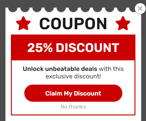
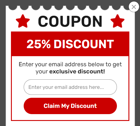
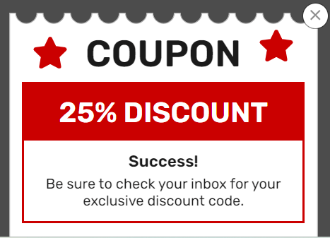
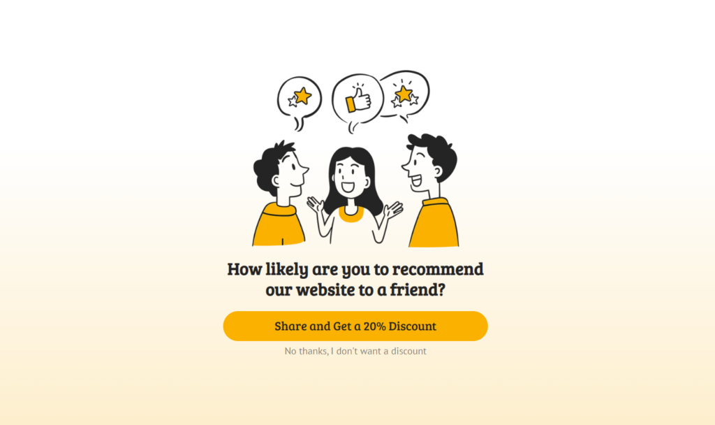
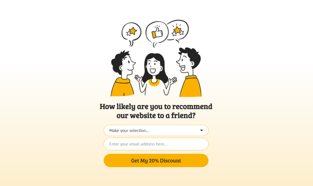
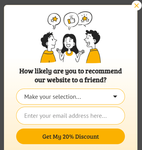
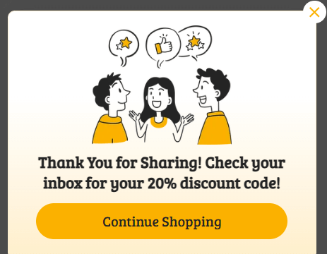
We’re thrilled to announce that we’ve added 3 brand new templates to our growing 700+ template library, designed specifically to help you drive conversions, collect valuable feedback, and build stronger relationships with your audience.
With Black Friday just around the corner, these templates— alongside our exclusive Black Friday campaign templates — offer the perfect solution to make sure your website is ready to convert as many visitors as possible this holiday season.
Let’s dive into how each of these templates can help you grow your email list and increase sales.
🚀 Template #1: Offer a Coupon (Slide-In)
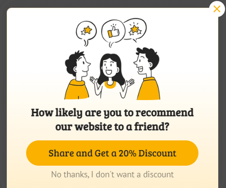
The Offer a Coupon (Slide-In) template is a highly effective way to boost conversions by presenting targeted discounts or promotions at the right time. With its slide-in format, it grabs attention without disrupting the browsing experience, making it ideal for encouraging action without overwhelming the user.
If you’re running an ecommerce store, offering a discount when a visitor is browsing your product pages or during checkout can make the difference between them leaving empty-handed or making a purchase. This template is designed to be subtle but compelling, making sure your offer is seen when it matters most.
For example, you can use this template to:
- Offer first-time visitor discounts to persuade them to make their first purchase.
- Provide exclusive discounts that appear when users scroll down product pages.
- Give a special checkout offer to nudge hesitant buyers into completing their purchase.
How to Get The Most out of This Template:
1. Target Abandoning Visitors
Capture abandoning visitors before they leave by triggering your coupon offer with Exit-Intent®. This works especially well on checkout or cart pages where users are close to completing their purchase. A timely discount can reduce cart abandonment significantly.
2. Give an Incentive to Highly Aware Prospects
Show your coupon only on pages that are most likely to drive conversions. For ecommerce businesses, this might be product pages or checkout pages. If someone is already considering a purchase, a coupon at this stage is highly likely to push them to complete their order.
3. Show Location-Specific Offers
Tailor your offers based on where your visitors are located. If you’re offering free shipping for U.S. customers but not internationally, use Geo-Location Targeting to show a free shipping offer only to U.S. visitors while presenting a different offer (like a percentage discount) to international users.
4. Engage with Invested Visitors
Display your coupon only after a user has shown clear interest by scrolling a significant portion of the page. For example, setting the slide-in to appear after a visitor scrolls down 50% of a product page makes sure they’ve seen enough content to be invested.
5. Optimize Based on Your Visitor’s Device
OptinMonster automatically optimizes campaigns for mobile, but you can create mobile-specific rules to only target mobile users. Use device-based targeting to show a specific coupon to mobile users that might be different from desktop offers. For instance, you can offer mobile users a special discount for completing their purchase on-the-go.
6. A/B Test Everything
Test different elements of your coupon offer to find what converts best. A/B testing allows you to experiment with various factors like coupon value, trigger timing, or even the copy and design of the campaign. This data-driven approach helps you fine-tune your campaigns for maximum effectiveness.
Start with testing simple variables like percent-off vs. dollar-off coupons or changing the headline to see which version drives more conversions. Use OptinMonster’s analytics to track performance and quickly identify the most effective approach.
📝 Template #2: Show a Customer Satisfaction Survey (Fullscreen)
The Fullscreen Survey template is all about grabbing your visitors’ full attention to gather important feedback or data. Since it takes over the entire screen, this type of survey works best when you need critical information and you want the user to focus solely on responding.
This template is ideal for scenarios where you want visitors to pause and provide meaningful responses. It’s highly effective for:
- Post-purchase feedback surveys to understand customer satisfaction.
- Lead qualification to determine the best segments for future outreach.
- Product interest surveys to gauge demand for new or upcoming products.
However, because it takes over the user’s screen, you’ll need to be smart about when and where it appears to avoid frustrating your visitors. It’s best to deploy fullscreen surveys when visitors are already committed to engaging with your brand or after they’ve taken a key action (like making a purchase).
How to Get The Most out of This Template:
1. Offer Post-Purchase Surveys for Immediate Feedback
The most natural use of a fullscreen survey is to ask for feedback immediately after a visitor completes a purchase. This is when the user is still engaged with your brand and more likely to provide honest and useful feedback.
Trigger the fullscreen survey only on the order confirmation page or after the thank-you page. Ask about their experience navigating your site, product satisfaction, or how they found your service overall. Since they’ve already completed the purchase, this is a low-friction moment to gather important insights.
2. Do Lead Qualification with Intent-Based Questions
If you’re in B2B or SaaS, qualifying your leads is crucial. The fullscreen survey can be a fantastic tool for gathering key information that helps you identify high-intent visitors and segment them for follow-up campaigns.
Use the fullscreen survey before offering gated content, such as an ebook or webinar registration. Ask questions like “What’s your main challenge right now?” or “Which product feature are you most interested in?” This allows you to qualify leads and follow up with the most relevant content or offer.
3. Collect Product Insights
The fullscreen survey can also be powerful for market research—like testing the waters before launching a new product. Let’s say you’re considering releasing a new product or service. Instead of guessing what customers want, ask them directly. This survey format ensures they focus on your questions without distractions.
Show this survey to visitors on specific product category pages or to returning visitors who have shown sustained interest in certain products. This way, you can ask them what they’d like to see next or which features are most important to them.
4. Create Engagement Surveys
Fullscreen surveys are ideal for highly engaged visitors who have already shown they are interested in your content. For instance, if you’re running a blog or providing long-form educational content, the survey can appear after a user has scrolled down a large portion of the page.
Set the survey to trigger after a visitor has scrolled 75% or more down a product page, blog post, or detailed guide. At this point, they’ve invested time and are more likely to respond. Ask them, “What else would you like to see from us?” or “Did you find this article helpful?”
5. Gather Free Trial Feedback
If you’re offering a free trial for a SaaS product or membership-type product, the fullscreen survey can help gather crucial feedback just before the trial ends. This can give you insights into whether the user intends to convert to a paying customer or why they might not.
Set the survey to appear a few days before the trial expires and ask questions like “What do you like most about the product so far?” or “What would make you more likely to continue with a paid plan?” This provides valuable insights for improving conversion rates from trial to paid users.
6. Use Exit-Intent® to Get Abandonment Insights
While Exit-Intent® is often used for discount popups, for a fullscreen survey, it can work well for understanding why visitors are abandoning a pricing page or checkout page. This should be reserved for high-value pages where understanding the reason for abandonment is crucial.
Use Exit-Intent® on pricing pages to ask, “What’s stopping you from signing up today?” or on product pages to ask, “What could make this product more appealing to you?” Gathering this information will help you refine your offers or even adjust pricing if necessary.
7. Nurture Your Leads Without Friction
If you run a content-heavy website like a blog or media platform, you can use the fullscreen survey to gather reader preferences. This can inform your content strategy by asking what topics they’re most interested in or what types of articles they want more of.
Use OnSite Retargeting® to show the survey to returning visitors after they’ve read multiple articles or after they’ve spent a significant amount of time on the site (e.g., 5 minutes or more). Ask questions like, “What would you like to read more about?” or “What brought you back to our site today?”
8. Avoid Overuse
Since the fullscreen survey takes over the screen, overusing it can easily frustrate visitors. Set the display rules so that it only appears once per session or even once per user, especially on high-traffic pages. This ensures you’re collecting data without being disruptive.
If a user has already completed the survey or interacted with it, avoid showing it to them again. This helps maintain a positive user experience and keeps your feedback data clean.
📝 Template #3: Show a Customer Satisfaction Survey (Slide-In)
The Slide-In Survey template is an excellent tool for gathering visitor feedback without being intrusive. It smoothly slides into view at the bottom of the screen, making it a less aggressive way to ask for input while visitors are still browsing your site.
The Slide-In Survey works best when you need quick feedback on specific parts of your site, such as a product page, blog post, or checkout process, but you don’t want to disrupt the visitor experience. Because the slide-in takes up less space than a fullscreen survey, it feels more like a conversation than a demand for attention. This makes it perfect for gathering insights from visitors who may not be ready for a long-form survey but are willing to provide a quick opinion.
Here’s how you can use this template effectively:
- On product pages to ask visitors how they feel about specific products.
- On content pages to ask readers if they found the article helpful or if they’re looking for more content on specific topics.
- During checkout to ask users if they encountered any issues or what might be preventing them from completing their purchase.
How to Get The Most out of This Template:
1. Trigger Surveys at the Right Time
Timing is key with slide-in surveys. You want to show the survey after the visitor has had time to engage with the content or product. For instance, triggering the survey too early may annoy visitors, while waiting too long could result in them missing the opportunity to provide feedback.
Use Scroll Trigger to display the survey after a visitor has scrolled through 50-75% of the page. This works well on product pages, blog posts, or long-form landing pages. You can ask simple questions like, “Was this information helpful?” or “What are you looking for in a product?”
2. Segment Your Audience with Smart Targeting
The Slide-In Survey is perfect for gathering targeted feedback from specific audience segments. For instance, you might want to ask first-time visitors about their initial impressions, while returning customers might be better suited for product satisfaction surveys.
Use Smart Tags and Page-Level Targeting to personalize your survey and increase the engagement rate. Ask first-time visitors, “What brought you to our site today?” and returning customers, “What could we do to improve your experience?”
3. Use Surveys for On-Site Polls
The Slide-In Survey is perfect for running quick polls to gather insights on specific products, services, or even customer preferences. For example, if you’re testing new product features or content ideas, a slide-in poll can help you gather feedback in real-time.
Trigger a slide-in poll after a visitor has spent 30-60 seconds on a product page or blog post. Ask something like, “Which feature would you like to see in our next update?” or “Would you like more articles on this topic?”
4. Ask for Checkout Feedback Without Disruption
Slide-in surveys can be used effectively during the checkout process to identify any roadblocks that might prevent a customer from completing their purchase. You don’t want to interrupt the flow with a fullscreen pop-up, but a slide-in survey at the side of the screen can be a subtle way to ask about their experience.
Trigger the survey on the checkout page to appear after a customer has been there for 30 seconds or more. Ask, “Is there anything preventing you from completing your purchase?” This can help you identify friction points in your checkout process without frustrating the customer.
5. Use Time-Based Targeting for Feedback After Key Actions
Another great use case is to trigger the survey after specific actions, such as when a visitor has completed a goal (like signing up for a newsletter or downloading a resource).
If someone downloads a guide, ask a follow-up question like, “What other resources could be helpful for you?” This allows you to gather real-time feedback on what topics and type of content your website visitors are looking for.
6. Test Different Survey Types with A/B Testing
The non-intrusive nature of the slide-in survey makes it ideal for A/B testing different question types. You can test between open-ended questions like “What are you looking for today?” and multiple-choice questions like “Which of these products interests you the most?”
Run A/B tests on different segments of your audience and track which survey type gets more responses. Use the insights to refine your messaging and improve future campaigns.
7. Create Customer Support and Satisfaction Surveys
The Slide-In Survey can also be used for real-time customer support feedback. For example, after a user has interacted with your support team via chat or email, you can trigger a slide-in survey asking about their support experience.
Trigger the slide-in survey after customer service interactions (e.g., post-chat or after reading an FAQ page) to ask, “Was this information helpful?” or “How would you rate your support experience?” This helps you gather immediate feedback on your support team’s performance.
💰Crush Your Holiday Sales with Our Black Friday & Cyber Monday Templates
The holiday shopping season is one of the most critical times of the year for businesses, and we’ve got exactly what you need to make the most of it. With 30 Black Friday templates and 24 Cyber Monday templates at your fingertips, you can easily turn your site into a conversion machine during this high-traffic period.
These templates aren’t just placeholders—they’re tested and proven to work by both us and our clients. Whether you’re running a massive Black Friday sale or extending the hype into Cyber Monday, these designs have been fine-tuned to grab attention, create urgency, and drive action.
Here’s how you can use our Black Friday and Cyber Monday templates to make the most of your holiday campaigns:
1. Popup Campaigns: Capture Attention, Drive Conversions
Popups are ideal for grabbing immediate attention. You can use them to promote your best holiday deals or offering exclusive discounts. Black Friday and Cyber Monday are all about urgency, and popups excel at creating that sense of “act now or miss out.”
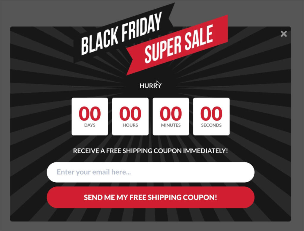
Tip: Use Exit-Intent® technology to trigger popups just before visitors leave, offering them an irresistible deal that keeps them from bouncing.
2. Fullscreen Campaigns: Maximize Engagement with Bold Offers
Our fullscreen templates completely take over the screen, making them ideal for the biggest, most attention-grabbing offers. These are perfect for site-wide Black Friday or Cyber Monday sales where you want to ensure every visitor knows about your best deals.
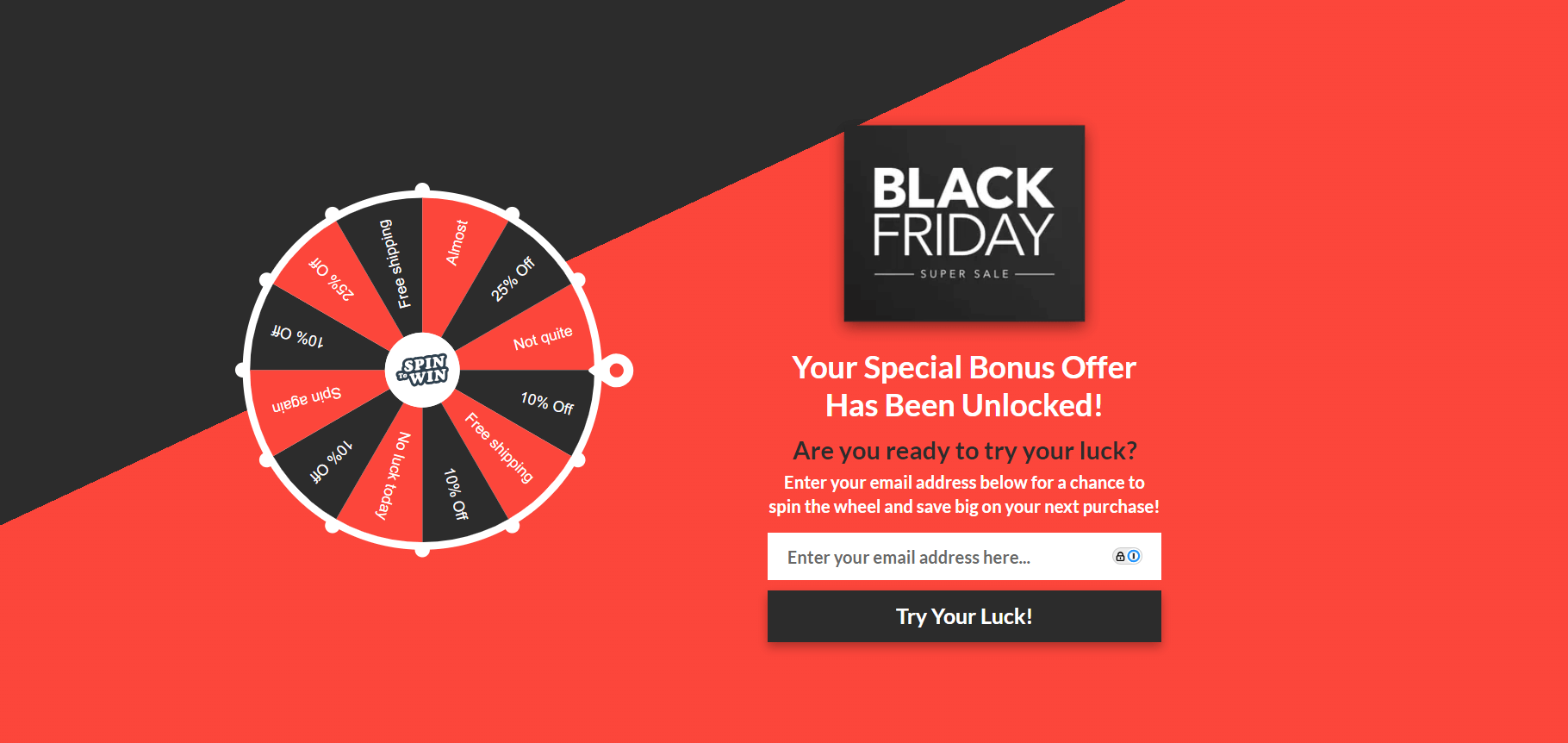
Tip: Use fullscreen gamified campaigns to get your website visitors invested in the process, which will lead to more action.
3. Inline Campaigns: Seamless, On-Page Offers
If you want to keep things subtle but effective, inline campaigns are a great choice. You can embed these directly into your content, making it easy and frictionless for visitors to engage with your Black Friday and Cyber Monday offers as they browse through your website and consume your content.
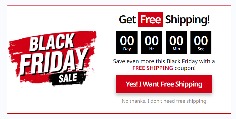
Tip: Use inline templates on high-traffic blog posts or product pages to seamlessly weave in your holiday offers without interrupting the browsing experience.
4. Slide-In Campaigns: Non-Intrusive, Yet Hard to Miss
Slide-in templates are perfect for delivering offers that gently appear from the side of the screen, making them hard to ignore without disrupting the visitor’s flow. These work especially well on product pages or checkout pages where visitors are already considering a purchase.
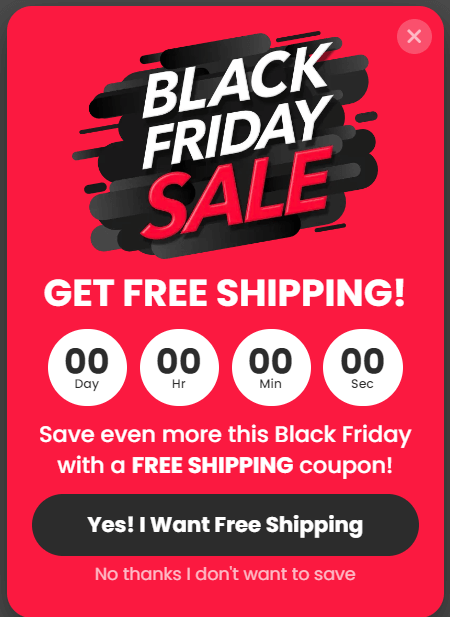
Tip: Use slide-ins to offer limited-time discounts or free shipping as customers are browsing, giving them an extra reason to make a purchase.
5. Floating Bar Campaigns: Keep the Deal Visible at All Times
For constant visibility, floating bars are perfect. They stay at the top or bottom of the screen, keeping your Black Friday and Cyber Monday deals in view without taking up too much space. This makes them great for promoting site-wide offers, flash sales, or countdowns.

Tip: Combine floating bars with Geo-Location Targeting to show different deals based on the visitor’s location, maximizing relevance and increasing conversions.
Why These Templates Work
Our templates are crafted to do more than just look good, they’re built to convert. Whether you’re looking to grow your email list, get feedback from your visitors, promote a sale, or convert abandoning visitors… these templates are designed based on foundational marketing principles and best practices that drive action.
They’ve been rigorously tested in the real world, so you can be confident that they’ll help you get more leads and sales from your website traffic. Each template in our library is fully customizable through our Drag & Drop Builder, which anyone can use without coding or design skills.

