Are you struggling to get more traffic and conversions on your product pages? Want to learn how to create high-converting product pages to drive more sales?
Product pages are among the most pivotal pages on your eCommerce site. They are where people decide to become your customers or leave your site for good.
If you want to have high-converting product pages, make sure you have the 17 ingredients in them.
17 Ingredients You Need to Create High-Converting Product Pages
Here are the 17 ingredients that you’ll need to build high-converting product pages. Feel free to click on a bullet point to directly jump to that section:
- Breadcrumbs
- Product Titles
- Images
- Videos
- 360° Views
- Product Description
- Product Details
- Product Options
- Price
- Urgency and Availability
- ‘Add to Cart’ or ‘Buy Now’ Button
- Live Chat
- Product Ratings and Reviews
- Add to Wishlist
- Views or Likes
- Cross-Sells and Recently Viewed Results
- Upsells
1. Breadcrumbs
In digital marketing lingo, breadcrumbs are links that show users where they are on a website relative to the homepage. They aid with navigation and help visitors discover related content on your site.
Breadcrumbs look like this:

According to a study by Baymard Institute, eCommerce websites should have 2 types of breadcrumbs: hierarchy- and history-based breadcrumbs.
A hierarchy-based breadcrumb allows buyers to see their current location with respect to the other pages of your site. Here’s a product page example of breadcrumbs on Amazon.com:

Without hierarchy breadcrumbs, it’s difficult for shoppers to browse a collection of products because there’s no way to go a step up in the hierarchy.
It’s kind of like using your browser’s ‘Back’ button. Without it, you’re either stuck or you have to make a drastic jump to find what you’re looking for.
Unlike the ‘Back’ button, which is history-based, hierarchy-based breadcrumbs don’t allow you to return to what you were just looking at a minute ago.
That’s where a ‘Back to results’ link like this one from Lowes comes in handy:

Keep in mind that shoppers can land on your eCommerce product pages in a variety of different ways.
Sometimes, they’ll need to find other related products in the same category, and sometimes they’ll want to go back to a previous search result. That’s why it’s important to use both hierarchy- and history-based breadcrumbs on your product pages.
2. Product Titles
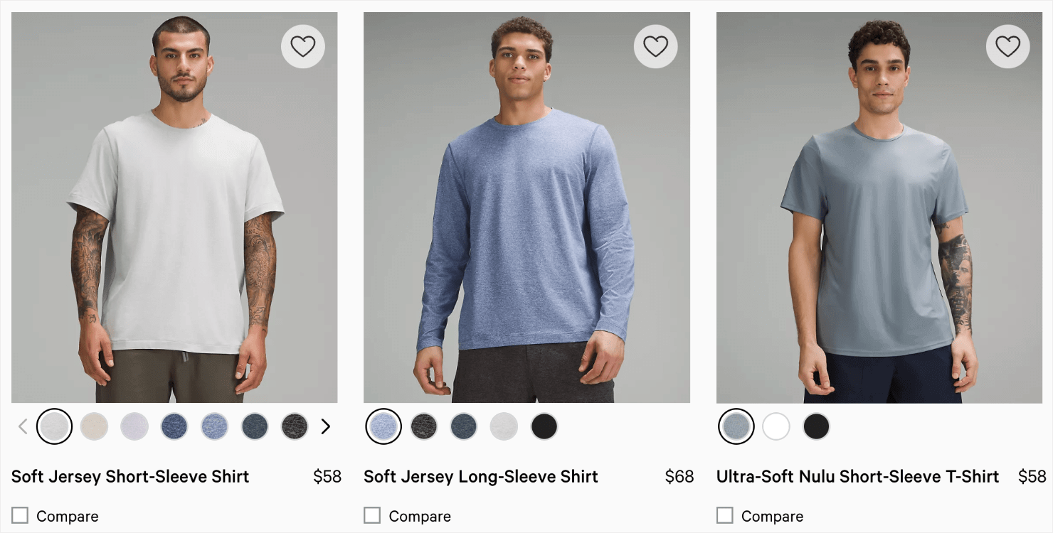
It might not feel like much, but a catchy product title often delights customers and adds to a product’s perceived value.
For SEO purposes, make sure your title tags are unique for each product. To make each landing page unique, include the product name, brand, model, and item type in your titles.
Here’s a product page example from Lululemon:
3. Images
High-quality product images are a must for any eCommerce business. People need to be able to see what they’re buying and see it as realistically as possible.
Your product images should be visually appealing, quick to load, and with options to zoom in for a closer look.
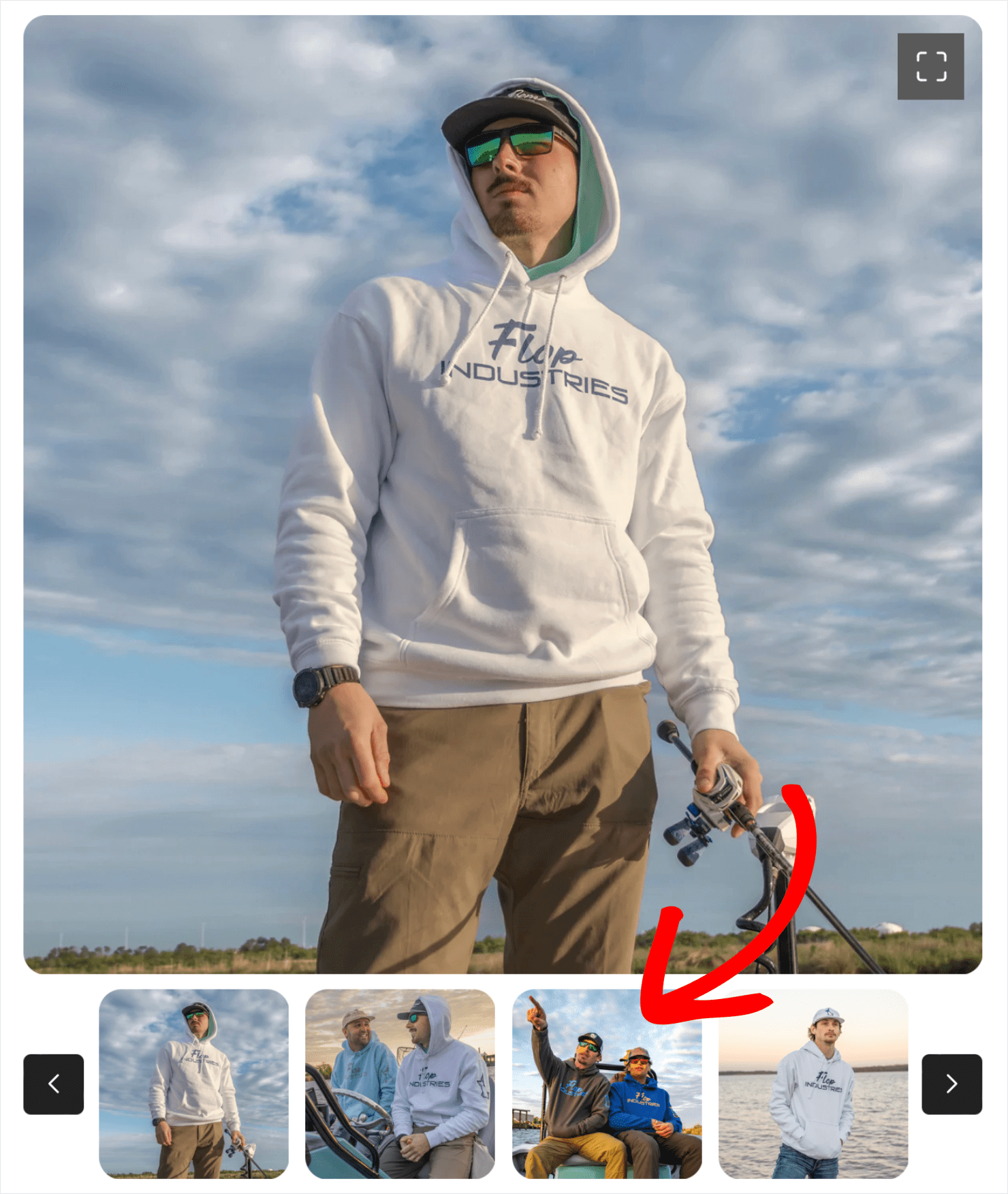
The more images that you have, the better. Make sure you showcase the product from different angles and in different contexts. Your users want to see your product in action.
Flop Industries shows off each of its products being used in different ways, in addition to the main product images:
4. Videos
Videos are an extremely powerful way to convince shoppers to purchase. With videos, it’s almost as if you’re shopping in person!
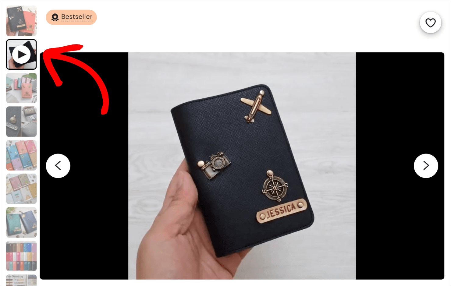
Etsy.com uses product videos to show what their products look like in motion. As the camera zooms in and out, buyers can get a much better idea of what a product looks like in reality:
5. 360° Views
Your shoppers may not be inside your physical store, but you can still give them a 360° view of your products. And it’s not as hard to do as you might think.
Sites like Arqspin allow you to use the camera you already own to capture and create 360° product photography and upload the images to your site in minutes:
The benefits of 360° views in eCommerce go beyond offering a better user experience (UX). According to XO3D, a UK-based creative consultancy:
“360° views can improve a website’s ranking on search engines. Customers are more likely to spend time exploring the interactive model, leading to increased engagement on the website. This increased engagement signals to search engines that the website provides valuable content, resulting in higher rankings on platforms like Google.”
6. Product Description
The best product descriptions are the ones that help buyers imagine their lives being better with your product.
The more descriptive you can get, the better. Avoid using stock descriptions that lack personality.
Create your own original descriptions for your products to make them more appealing. Writing original product descriptions also allows you to incorporate the right keywords in your product page and get you the SEO ranking benefits.
Northmen ditches conventional product descriptions altogether and tells the story of their product. This is how they describe one of their products, an American Felling Axe:
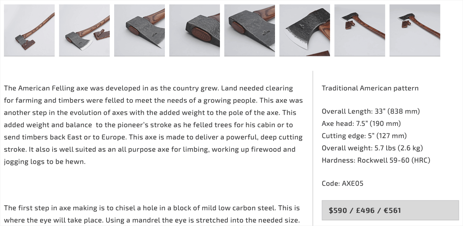
You could purchase a similar ax for about $50, but Northmen charges $590 for this one.
How are they able to charge such high-end rates for such a basic utility tool? They leverage their product description and visual storytelling to enhance the product’s value and entice potential customers into buying it.
7. Product Details
Aside from the product description, what other details, specs, dimensions, or features can you use to make the product more attractive?
You can answer the most common questions shoppers might have about your product. This can stop customers from bouncing off of your product page because they didn’t understand your product.
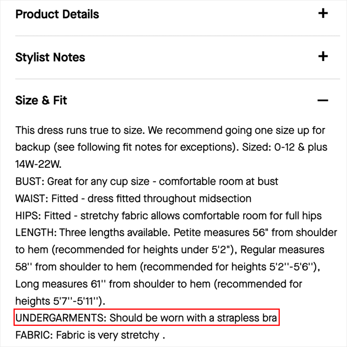
Rent the Runway does an excellent job of going the extra mile to answer shopper’s potential questions.
They not only include a detailed ‘Size & Fit’ guide, but they also suggest what undergarments can be worn with a party dress:
You can also include tips about how to use your product.
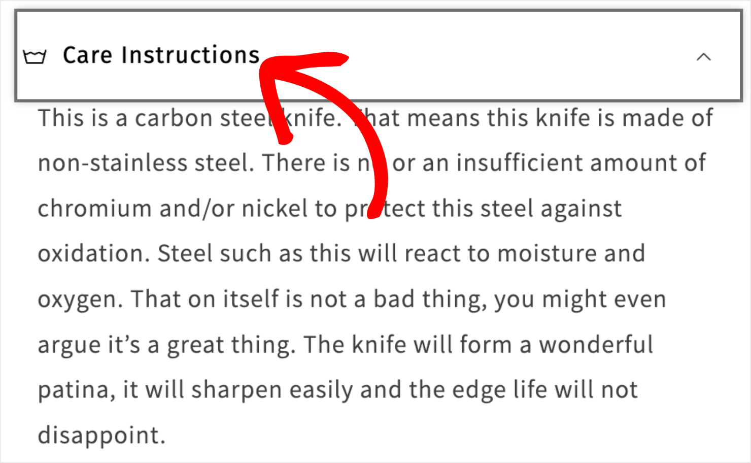
Karasu explains how to care for your knives by storing them clean and dry and wiping them with a cloth towel. This serves a dual purpose: it provides the customer with valuable information, and it re-enforces the idea that their knives are high-end:
8. Product Options
If your products come in different sizes, colors, or styles, make sure it’s easy for shoppers to choose between various options.
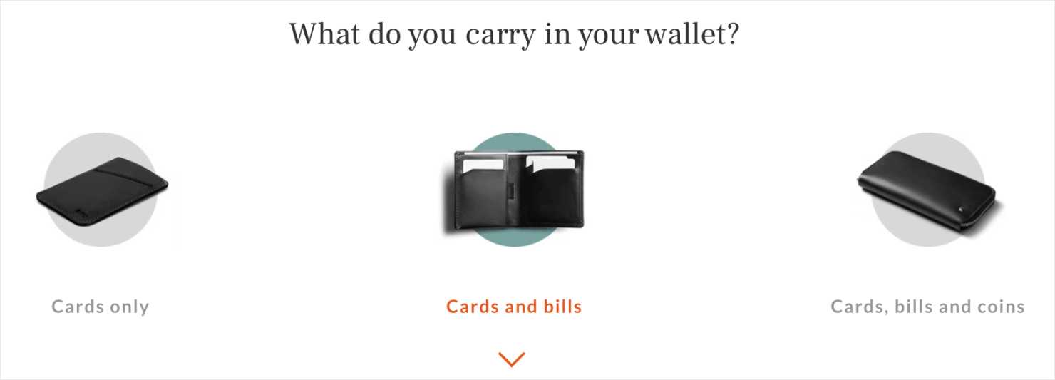
Bellroy does an amazing job of laying out each of their different wallet options. By displaying photos of each option side-by-side, shoppers can come to a much quicker purchasing decision about which wallet they want to buy.
They even arranged each wallet option on a scale from the slimmest to the most fully-featured:
9. Price
Regardless of what you decide to charge for your products, there are a few pricing techniques you can use to help them sell better.
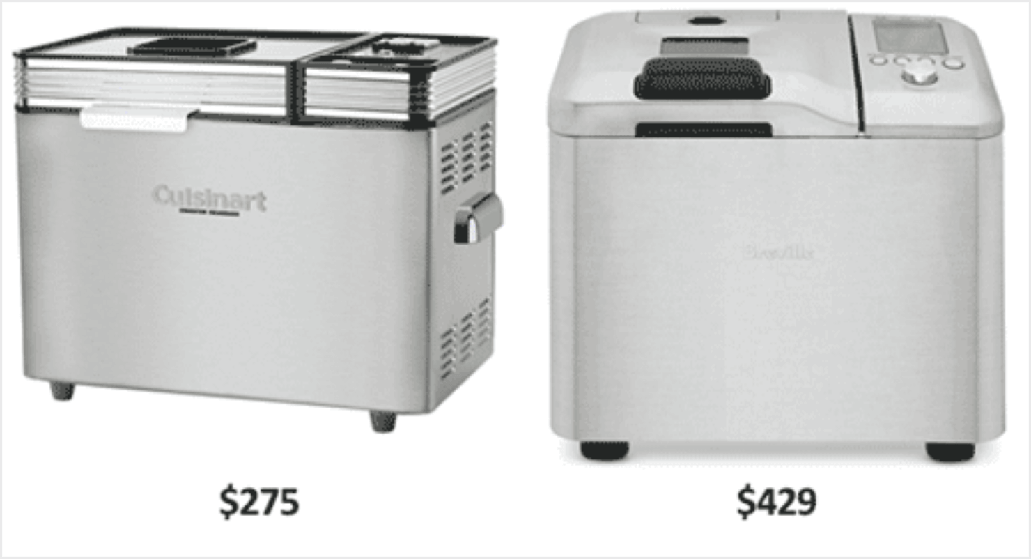
One technique is to offer a premium version of your product and make sure that shoppers see the 2 products side-by-side. This provides contrast and helps make the lower-priced product appear to be more of a ‘good deal.’
This is known as the decoy effect, and there’s a popular anecdote about how it works:
Williams-Sonoma was having trouble selling their $275 bread maker. So, they introduced a similar bread maker (which was only marginally better) and put a $429 price tag on it.
They placed the 2 bread makers next to each other in a print ad, and sales for the $275 bread maker skyrocketed.
Another strategy is to use the left-digit effect, which shows that consumers generally pay the most attention to the leftmost digit when looking at a price tag. This means that you can charge $0.01 less for an item, and people will be more likely to buy it.
So instead of charging $30 for a product, try pricing it at $29.99. You can run A/B testing experiments and see which works best for you.
10. Urgency and Availability
When buyers are not sure about buying something from you, they’ll usually leave your site thinking that they’ll come back to buy it again. In reality, 70% of visitors who abandon your site never come back again.
One of the best ways to fight this churn is to add a sense of urgency to your products. You can create offers that make shoppers feel that if they don’t buy now, they might lose the deal forever.
Fear of missing out (FOMO) is a powerful psychological trigger that does wonders in convincing people to take immediate action.
2 especially effective ways to add urgency to product pages are by limiting time or quantity.
For example, you could display a countdown timer until a deal expires. Or, display the limited number of items left in stock.
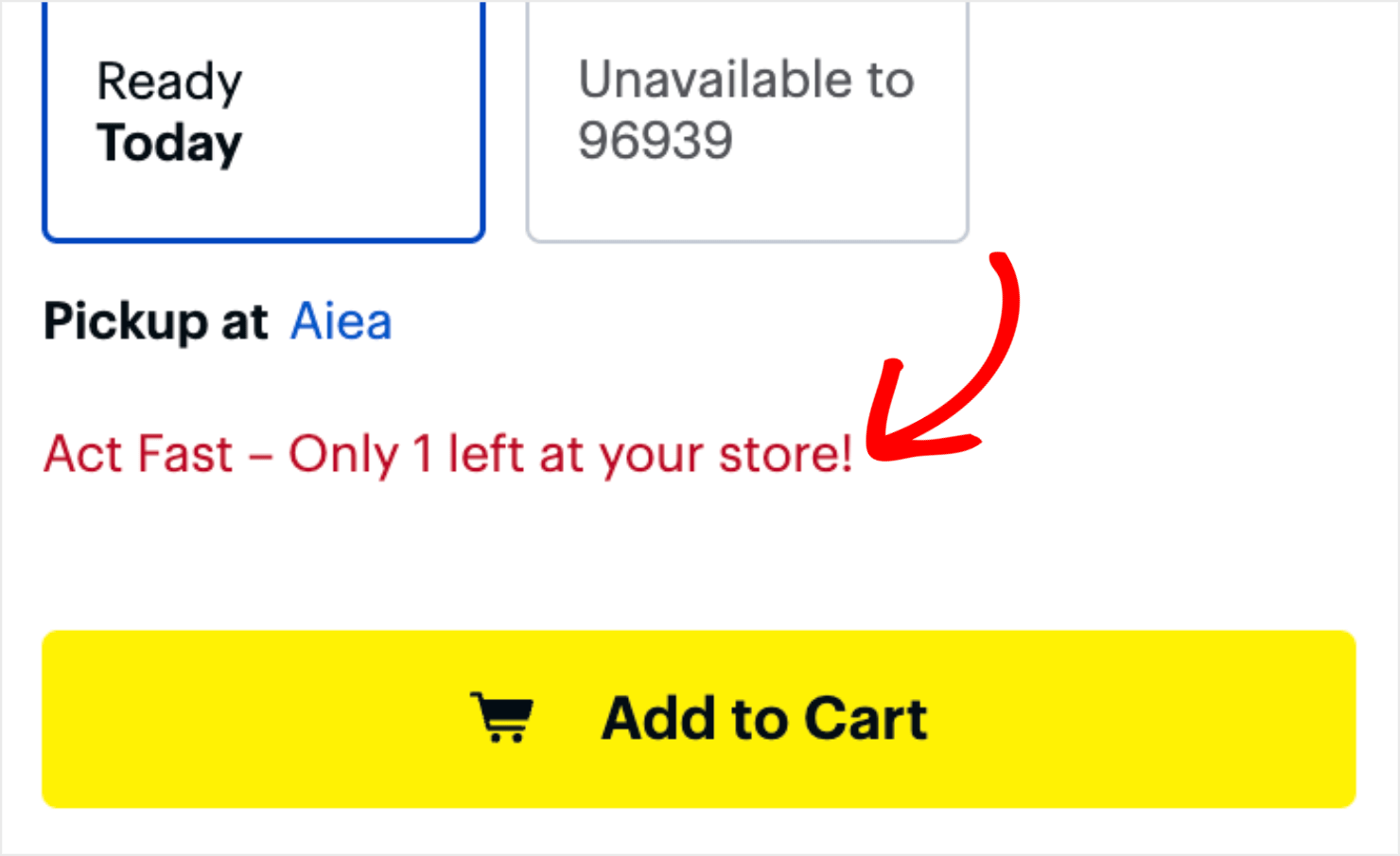
Best Buy does an excellent job of including both forms of scarcity on their product pages. For some of their products, Best Buy shows countdown timers to show when the deal expires:

For other products, they show the limited quantity available in stores near you:
Other sites, like eBay, even show how many other buyers are currently viewing the item to fuel the urgency further:

But what if a product is already sold out? All is not lost! Here’s how to win more sales with ‘out of stock’ pages.
To really kick your sales into high gear, check out TrustPulse. With TrustPulse, you can leverage the power of social proof, which plays nicely with urgency.

With TrustPulse, you can also add trust badges or trust seals to communicate that your site is secure, reliable, and trustworthy. Adding TrustPulse to your site gives you an instant lift in page conversion rates by up to 15%.
11. ‘Add to Cart’ or ‘Buy Now’ Button
If your ‘Add to Cart’ or ‘Buy Now’ button doesn’t stand out, people aren’t going to click on it. Make sure the color of your call to action (CTA) button stands out from the rest of your page.
Also, ensure that your product page design is free of unnecessary clutter that can distract your potential buyers. This is especially important when you’re creating product pages for customers who shop on mobile devices.
Here’s how Amazon shows both ‘Add to Cart’ and ‘Buy Now’ buttons next to each other, but prominently displays them on its product page:
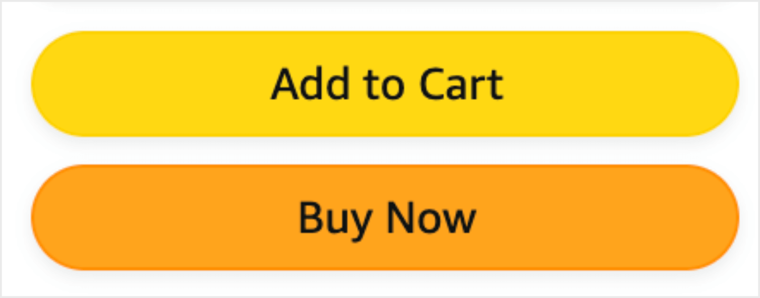
It’s also important that the copy in your CTA buttons matches the button’s actual behavior. For instance, the ‘Buy Now’ button should take people to a checkout page.
The ‘Add to Cart’ button should take them either to the shopping cart page or show a message confirming that the item has been added to their cart.
12. Live Chat
A lot of buyers prefer to have all their questions answered before they make up their minds to buy from you.
Sure, you can add a detailed product description or include a frequently asked questions (FAQs) section to answer their queries.
But what if they have more questions? Offering live chat on your site is the best solution.
Research from Hiver shows that 63% of buyers are more likely to purchase from websites that offer live chat support.
Millennials prefer live chat over every other channel of support like email, phone, or social media.
If you can’t answer your buyers’ questions in real-time, they might leave your site without buying anything.
To stop this from happening, use a live chat option on your online store so that prospective customers can get their concerns answered immediately.
Here are some great live chat app recommendations for your eCommerce store:
- SnapEngage: Starts at $60/month for up to 4 agents.
- PureChat: Starts free for up to 15 chats per month, with integrations starting at $15/month.
- Zopim: Starts at $11.20/month.
- ClickDesk: Starts at $16.99/month.
- Comm100: Starts at $29 per operator per month.
- Kayako: $24 per agent per month when billed annually.
- Velaro: starts at $29.95 per month per agent.
13. Product Ratings and Reviews
People place a lot of value in product reviews and customer testimonials. They trust customer reviews from past buyers more than what a brand has to say about its own products.
You can leverage product ratings and reviews by showing them next to your product listing. To get more customers to review your products, add an option on your site for them to submit their feedback.
Here’s a product page example from Walmart that shows product ratings and clickable customer reviews:
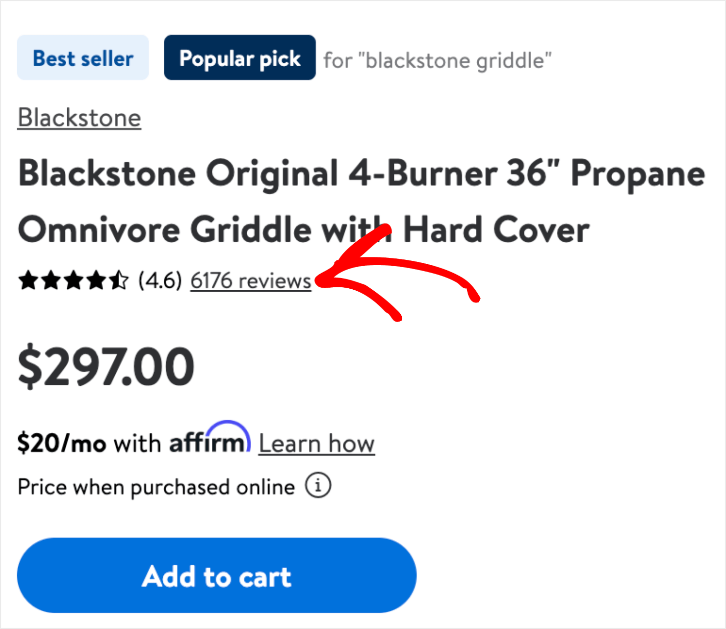
Don’t be afraid if you get the occasional bad reviews. So long as good reviews outweigh them, this can only be a beneficial addition.
14. Add to Wishlist
Some shoppers will not be ready to buy from your site when they land on your product page. But if you give them a way to save their item for later, you’ll have a much better chance to improve your product page conversion rather than losing business to a competitor.
Offering the wishlist option is a great way to do that. With wishlists, customers can add their favorite items to their wishlist and come back to buy them later.
This works due to a psychological phenomenon called the Zeigarnik effect. The Zeigarnik effect is the idea that people tend to finish tasks they’ve left unfinished.
So when customers add specific items to their wishlists or shopping carts, the Zeigarnik effect persists in the back of their heads until they finish the checkout.
Johnny Cupcakes offers its customers a personalized wishlist that lets them specify the size and color of t-shirts that are currently unavailable on the site. Then, when the t-shirt is back in stock, Johnny Cupcakes notifies them via email:
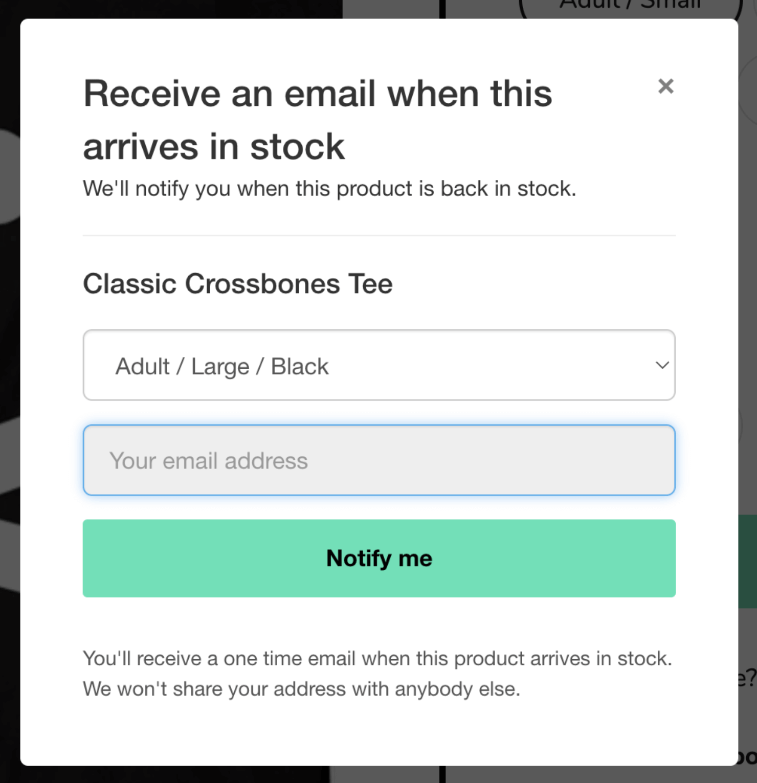
This is a really cool hack not just to increase conversion rate optimization (CRO), but to generate leads that they can market to later.
15. Views or Likes
If you have a good number of views on your product pages, show it off!
Deviant Art shows the number of views and comments on each of its products, along with the number of favorites:

You can take inspiration from this and add the ability for online shoppers to ‘like’ products, and show off those numbers as well.
Here’s a product page example from LightInTheBox that offers this:
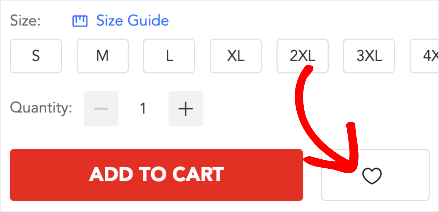
You should only use this technique if your numbers are worth bragging about. Until you reach that point, keep your numbers under your hat.
16. Cross-Sells and Recently Viewed Products
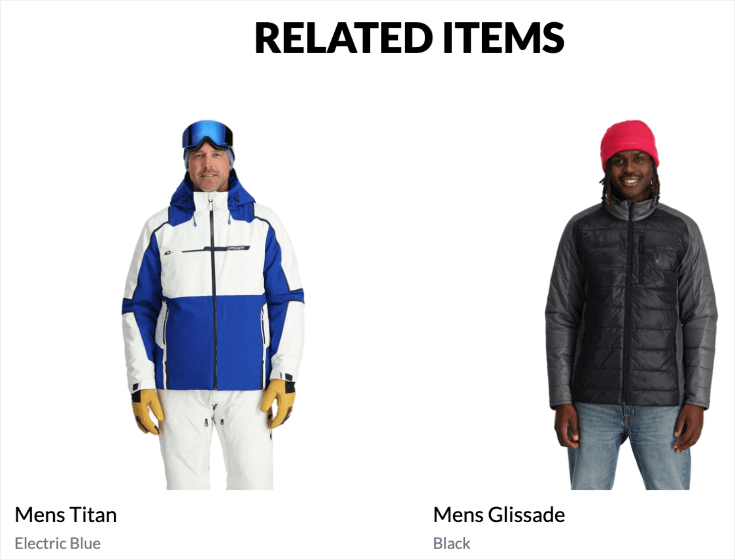
If one product isn’t right for your buyers, you should encourage them to stay on your site looking at other products. A great way to do that is by presenting related products that you can cross-sell to them.
Spyder shows related items so it’s easier for customers to discover similar other products they might be interested in:
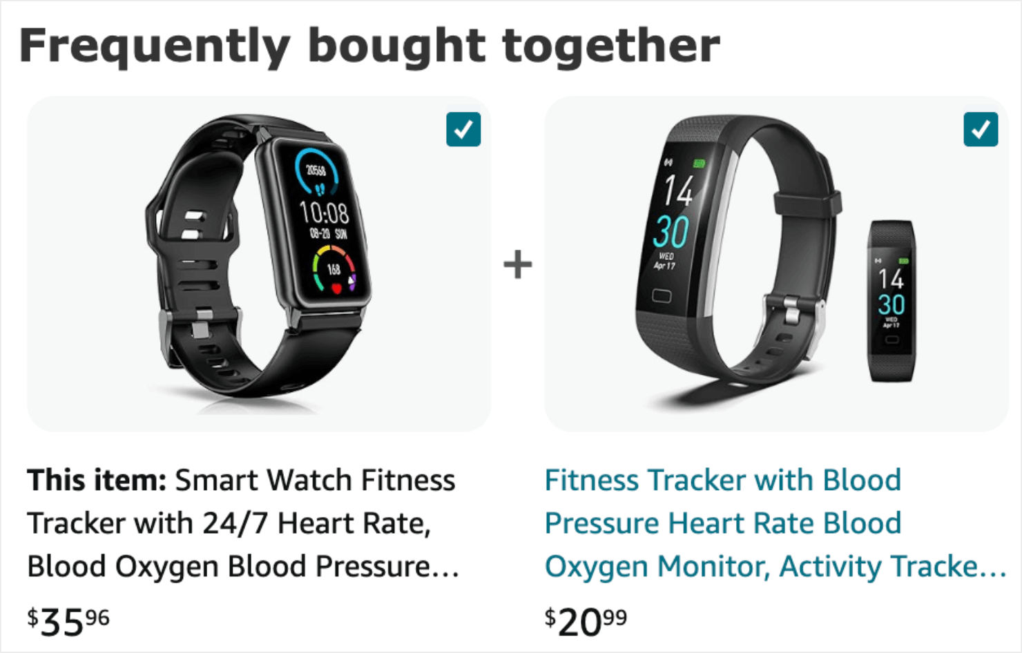
Amazon shows ‘Frequently bought together’ items to improve its cross-selling and expand its sales potential:
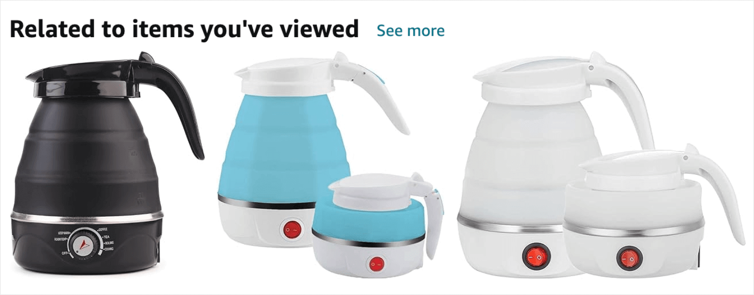
It also shows suggestions based on your recent views and purchases:
17. Up-Sells
This last section of your product page is also a good place to upsell higher-end products related to the item.
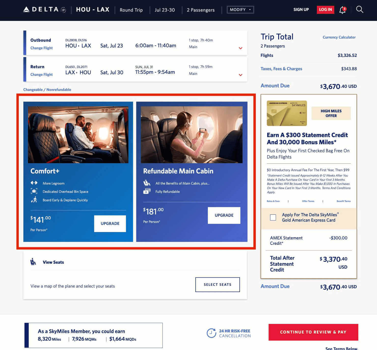
Product Upsell allows you to create and display relevant upsell offers and add-on products based on shopping cart content, total cart value, past purchases, or a combination of them all.
You might have seen this on flight booking websites where the sites try to upsell you add-on services like seats with extra legroom, airport taxi pick-up, or in-flight meals:
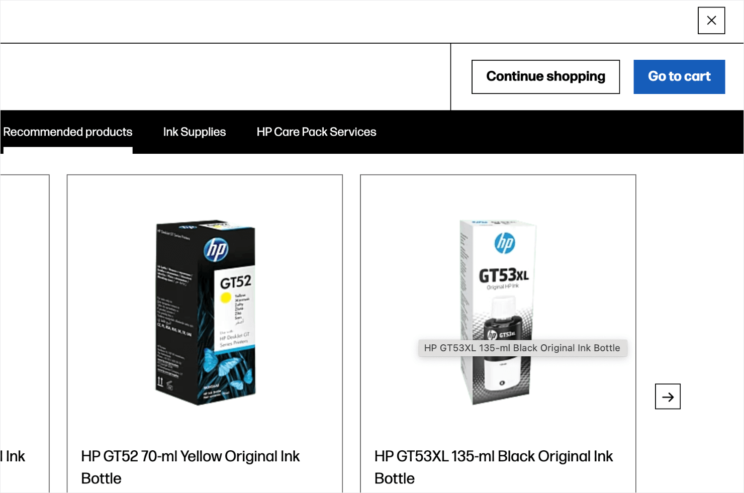
Here’s a similar product page example from Dell.com. When customers are about to check out one of its printers, Dell recommends its customers buy ink bottles to go with the main item:
Ready to Create The Perfect Product Page?
Apply the tips mentioned in this post to improve your product page’s conversations. If your product page is missing any of the ingredients discussed above, run split tests by adding the missing piece to it and see if it leads to higher conversions.
If you liked this post, you might also be interested in the following resources:
- How to Create a Product Recommendation Popup (the Easy Way)
- Ultimate eCommerce Optimization Guide: 13 Tips to Boost Sales
- eCommerce Best Practices: Set up Your Business for Success
Want to see how you can convert visitors who are about to leave your product page? You can prevent them from churning with an Exit-Intent® popup.
Join OptinMonster today to create and publish your Exit-Intent® popup within under 5 minutes!
Disclosure: Our content is reader-supported. This means if you click on some of our links, then we may earn a commission. We only recommend products that we believe will add value to our readers.
