
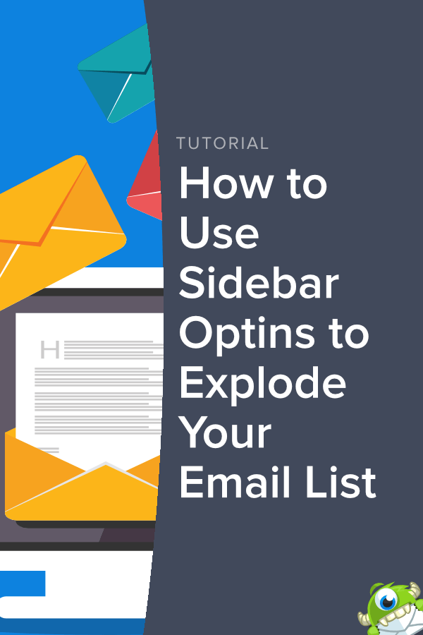
Are you passionate about using every tool at your disposal to grow your email list and create more conversions? In this article, we’ll discuss one such tool that’s as powerful as it is subtle:
Sidebar optins.
More specifically, we’ll look at:
- Why you should be using sidebar optins on your site
- Why some blogs think you shouldn’t
- 3 examples of creative sidebar optins that convert like crazy
- How you can build your email list with sidebar optins
But before we do anything, let’s make sure we’re all on the same page and look at what we mean by a sidebar optin.
What Are Sidebar Optins?
Sidebar optins are lead generating forms usually found on the right-hand side of a webpage. They’re typically used as a way of collecting email subscribers without disrupting any of the on-page content.
Here is an example of a sidebar optin from OptinMonster’s blog:

As you can see, the content of the page is neatly aligned to the left. Our sidebar optin form doesn’t distract the reader but remains available to anyone who would like to subscribe to our optimization tips and resources.
Now, we know what you’re thinking.
“That’s cool. But aren’t there better, more flashy lead generating tools I can use?”
And you’re 100% right.
Sidebar optins probably aren’t going to be the sexiest part of your marketing strategy. But in many cases, they are the exact tool you need for some users to jump from casual readers to loyal customers.
In fact, it’s their subtlety that makes sidebar optins so effective. But that’s not the only reason.
Let’s turn the discussion to why every website owner should be using sidebar optins.
The Benefits of Using Sidebar Optins
It’s true. Sidebar optins are more subtle than other lead-generating campaigns.
They aren’t as attention-grabbing as a giveaway popup. They aren’t as visually welcoming as a fullscreen welcome gate. And they don’t have triggers to appear at targeted times (like campaigns with exit-intent technology to stop users from leaving your site).
They don’t have any of those flashy things. And, frankly, sidebar optins don’t need them.
That’s because sidebar forms have their own unique set of benefits that make them worth using:
- Sidebar optins aren’t as intrusive to your visitor’s user experience (UX) as some campaigns
- They don’t distract the reader from your content
- Sidebar forms turn every page of your site into a lead generating opportunity
- They can still be targeted to a specific audience like any other campaign on your site
At the end of the day, sidebar optins are like the Information Desk at the mall. You probably walk by them without noticing, they don’t disrupt your shopping experience, but they’re always there if you ever need or want something.
So what are the downsides to sidebar optin forms? That’s just the thing.
There really aren’t any. At least none that matter. But more on that in just a minute.
Plus, when you use your sidebar to create leads, you’re also opening up that entire space of your blog to other opportunities. Things like running ads or redirecting customers to popular pages on your site.
MonsterInsights, for example, uses a sidebar optin form to collect email addresses. But they also use the space in the sidebar above their optin form to redirect traffic to their sign up page:

If MonsterInsights only used one or the other (the redirection page or the optin form), the webpage design would start to feel unbalanced.
But when both are working together, they make the user interface (UI) feel natural without getting in the way of the content.
So if sidebar optins have these unique benefits with no drawbacks, should all blogs use them?
We think so. But to be fair, not everyone agrees.
The Opposing View
Ok, now it’s time for some full disclosure:
Not everyone is a fan of using sidebar optins. There are some blogs that view the tool as a waste of time.
GrowthRock, for example, ran a test on their sidebar optin and found it was only converting between 0.3–0.6% of their traffic:

At over 4,000 impressions, they had 18 conversions. And let’s be honest: that’s a low conversion rate.
But if OptinMonster recommends using sidebar optins, why would we share this information with you?
Well, for starters, we think you should have all the information to make up your own mind. Our hope is that by the end of this post, you’ll see as much value in sidebar optins as we do.
But, again, that’s up to you!
Second, even though 18 conversions out of 4,000 impressions isn’t a miraculously high conversion rate, it’s also more than zero. Since we don’t know exactly how long the test ran (it appears to be a week in the image, but isn’t clear), let’s be safe and say it was a month.
At the same conversion rate, your sidebar optin would generate 216 new leads each year. That’s 216 potentially lifelong customers who came from an optin form that took 5 minutes to build and doesn’t get in the way of your content.
And the third reason we share the opposing view with you is to highlight an often overlooked fact of marketing:
Using one strategy doesn’t mean you can only use one strategy.
We understand that some sites are critical of sidebar forms because they don’t have the highest conversion rates. But if you’re using multiple lead generating campaigns together, sidebar optins are the perfect tool for picking up some low hanging fruit that may have been otherwise missed.
And if you want to make your sidebar optin forms convert, you simply need to know how to make them the right way.
Let’s switch gears and get some inspiration from a few sidebar optins that got it right.
3 Examples of Sidebar Optins Done Right
1. The Pop Quiz

Why we love it: This is a solid example of a sidebar form for two reasons. First, it’s interactive. This sidebar optin asks a friendly question in the form of a Pop Quiz to engage readers.
Second, it takes advantage of the power of 2-step optins. Rather than asking for the user’s email address right away, it encourages them to start the optin process. Once the process is started, clients are more likely to convert thanks to the Zeigarnik effect.
Improvements? We recommend making this form interactive by turning options A–D into buttons redirecting to your email signup or content related to the text of the button they clicked. Option E would also be a button simply closing the campaign.
You can do this directly in your OptinMonster editor. All you need to do is create and configure a Button element for options A–E.
Want to create your own campaign using buttons? Check out our Yes/No popup tutorial.
2. The Clever Title

Why we love it: This sidebar optin gets points for its strong headline. The subheading is also concise, interesting, and offers a great value proposition. All the text is focused on the reader (using “you” and “your” instead of “we”), and they ask for minimal information to sign up.
Improvements? The background image puts white text directly behind the optin form’s copy (which also happens to be white text). That clashes with the overall design and can be hard on the eyes.
We recommend replacing the background image in this campaign with a solid color (light blue) so you don’t distract readers from the main text. You can do this directly in your OptinMonster editor.
Simply click on the element you want to change. Then, in the left-hand side menu, click Block at the top to edit the block’s features. The ability to change the Background Color will be one of your first options:

3. Keepin’ It Simple
![]()
What we love: This sidebar optin is totally stripped down of flash and glam. It gets to the point, asks for minimal information, and uses a subtle color scheme.
Improvements: You could argue that this sidebar optin doesn’t have enough visual appeal. It could definitely be enhanced by an image or a more engaging headline. But to be honest, there’s nothing wrong with this type of subtle sidebar optin.
How to Use Sidebar Optins to Grow Your Email List
Let’s get real:
Sidebar optins aren’t going to revolutionize your entire marketing strategy.
Why not?
Because that’s not the purpose of a sidebar optin. What they will do, however, is turn every page into a lead converting opportunity and convert more visitors than you would have otherwise had.
Remember, every lead is an actual human being, and every human being is a potential lifelong customer. If your sidebar is consistently getting you a few hundred extra leads per year, it’s more than worth its 5-minute investment time to build and embed.
That said, there are a few things you need to know in order to make your sidebar optin form convert as much as possible. The following tips will put you on the right track:
Put Them in a Prominent Position: If you want your sidebar optin form to convert, it shouldn’t be buried under mountains of ads or redirects. Instead, when your customer lands on the page, they should see the sidebar optin form immediately without any scrolling.
WPForms shows us a good example of this on their blog:

Considering the average person only reads 37 seconds of a blog post, you want to position your sidebar form right upfront.
Choose the Right Colors: Your sidebar optin form should, to a large extent, blend into your overall site. While you want your customers to see it, you don’t want it to be all they see. Make sure you choose colors that match your brand but don’t constantly fight for your reader’s attention.
Here’s a good example by Louise Myers, a visual marketer for social media:

Notice the colors in her actual post are bright yellow. Her sidebar optin uses the same color scheme but in a toned-down way.
This sidebar gets your attention. It doesn’t steal it.
Only Ask for the Information You Need: In many cases, your sidebar optin form should at most ask for a name and an email address. Often, just an email address will do.
Remember, every field your optin form contains is another hurdle for your reader. Limit the number of hurdles they need to jump to subscribe.
Here’s a great example by SeedProd:

This gets the user’s first name and email address. With this information, SeedProd can send personalized messages for the email marketing campaigns.
Don’t Rule Out 2-Step Optins for Your Sidebar: Sometimes people think 2-step optins are for popups, inline forms, floating bars, or other powerful campaigns. But they can work wonders for your sidebar optin form as well.
Here’s a great example by Wholesale Suite:

Though the sidebar optin form is a little long, it can use the extra space because it doesn’t ask for any further information.
Clicking the Download The Guide link will begin the optin process. As we already discussed, once a user has started opting in, they’re more likely to finish.
How Can You Make a Sidebar Optin Form?
This post has covered a lot of information about how to use sidebar optin forms to build your email list. Now the question on everyone’s mind?
How can I make one that looks nice and converts?
Fortunately, we have the exact resource you’re looking for. Read our in-depth and detailed guide to creating a sidebar optin form. This post will teach you everything you need to know to build a killer sidebar optin form in a matter of minutes.
And the really cool thing?
If you decide to build it with OptinMonster, you have so many other tools at your disposal.
Remember earlier how we said your sidebar optin form shouldn’t be your only strategy for growing your email list? With OptinMonster, you’ll have a whole toolbox of resources right at your fingertips.

You can create matching popups, inline forms, floating bars, and a variety of other campaigns. The trick is to not come off too salesy. Here are some great ways to capture email leads without being pushy.
Everything about OptinMonster is designed to accomplish three things:
- Drive traffic to your site
- Generate more leads
- Increase sales
That’s because OptinMonster isn’t just another lead generator. It’s an entire optimization conversion toolkit that has been proven to help companies level-up their business.
Sound like something you want to be a part of? We’d love to see our trusted tools in your hands. Don’t put it off a second longer. Join OptinMonster today!

Disclosure: Our content is reader-supported. This means if you click on some of our links, then we may earn a commission. We only recommend products that we believe will add value to our readers.